Scandinavian style apartment in soothing shades of gray.
This is a project of an apartment located in area which used to be industrial. There are a lot of new residential complexes being built now, public spaces are being actively developed, and they even promise to build a subway someday. The customers purchased an apartment situated on the top floor within one of the buildings of the new residential complex "Palazzo."
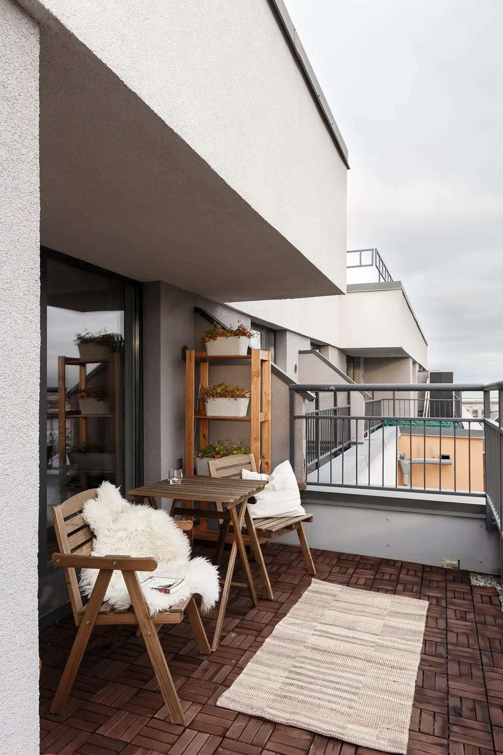
The apartments on the top floors have their own large terrace with access from all rooms and large floor-to-ceiling windows. The terrace offers a beautiful view on a rooftops and water.

How we worked with the client
The original apartment layout was far from ideal. It's a 2-room apartment, and all the walls separating the rooms were structural load-bearing walls, meaning we couldn't simply remove them. The second challenge was that a sewer riser with an inspection manhole and a ventilation pipe ran through the apartment in the corridor.
We had two options for the renovation project:
- Maintain the existing layout without any structural changes: In this case, we wouldn't be able to accommodate any specific customer requests, and the layout would remain as it is.
- Opt for significant structural changes: By choosing this option, we would have the freedom to make substantial planning decisions, allowing us to experiment with the layout and incorporate all the envisioned changes and customer requests.

Wishes of the customers
The clients, a young multi-cultural family, had specific requirements for the apartment's layout:
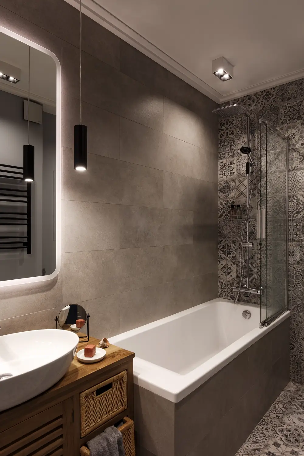
- Two bathrooms (one with a bathtub, one with a shower).
- laundry room.
- kitchen-living room.
- wardrobe.
- office and a bedroom.
Yes, quite a lot for a total area of 66 sq. meters. In the end, the customers decided to take measures in the redevelopment, and we set to work.
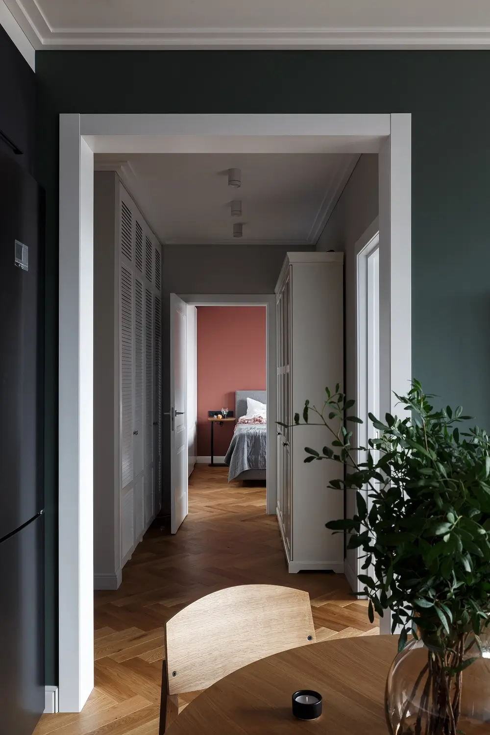
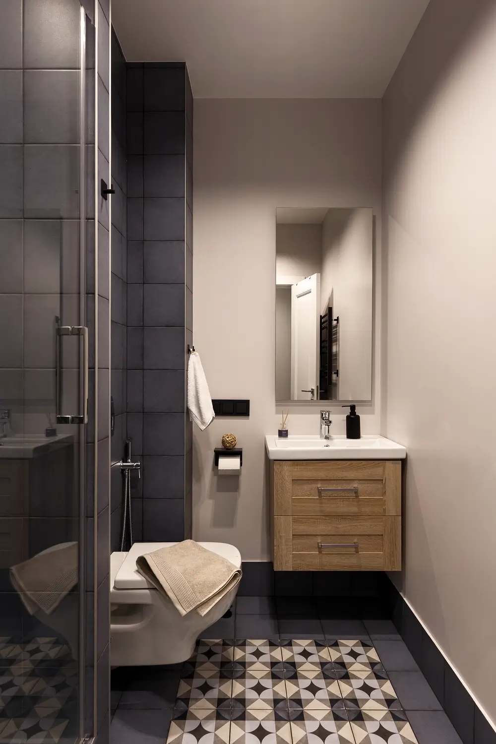
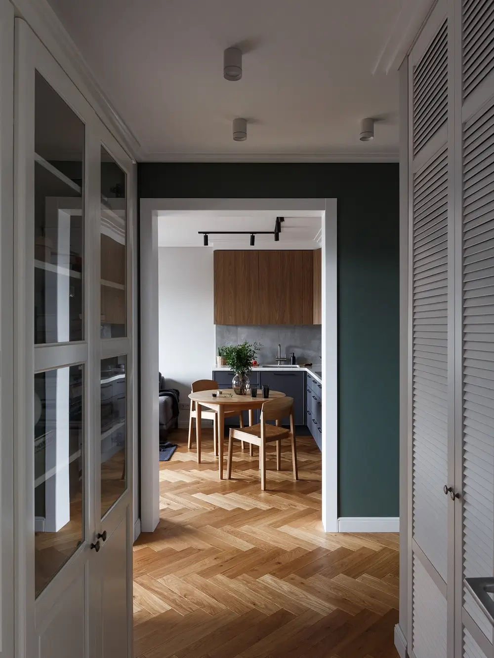
We made 2 openings in the 2 bearing walls on one axis. The existing bathroom at the entrance was larged at the expense of the corridor and placed there a shower room. In place of the old corridor made a dressing room and increased the bathroom in the bedroom. At the same time, the new corridor was moved deeper into the apartment. Thus, it was placed on the axis of the new openings in the walls, and we managed to create an enfilade effect. A small utility room was allocated at the entrance to the bathroom.
With the new floor plan we have reduced space only for the cabinet. The bedroom and living room remain the same size.
Stylistically, everything was very clear at the initial stages of work. Simple Scandinavian design in modest colors with little decor, but at the same time cozy and homely.
Experienced with different customers and interiors, sometimes it happens that the final look of the apartment may be different from the visualizations, which were made in the process of work. Here everything came out exactly as we thought it would.
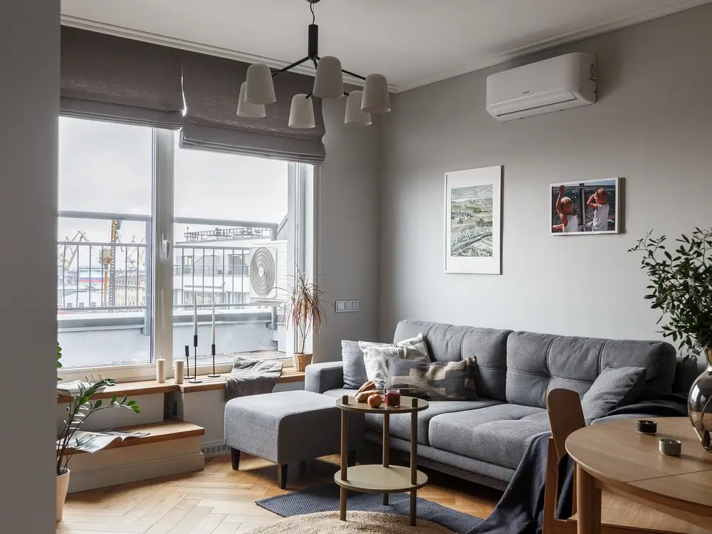
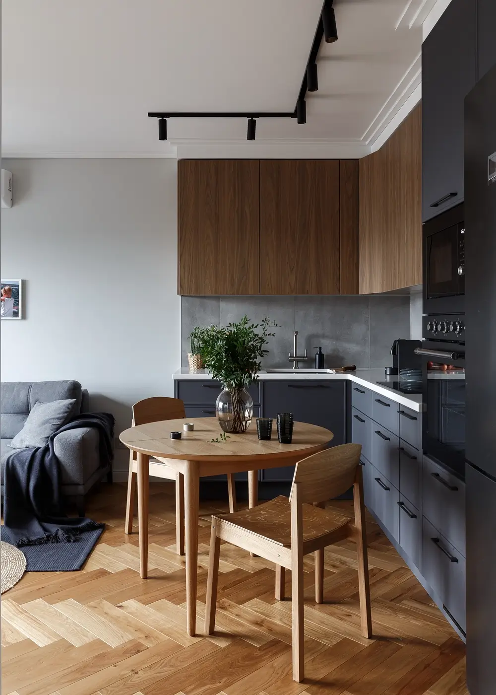
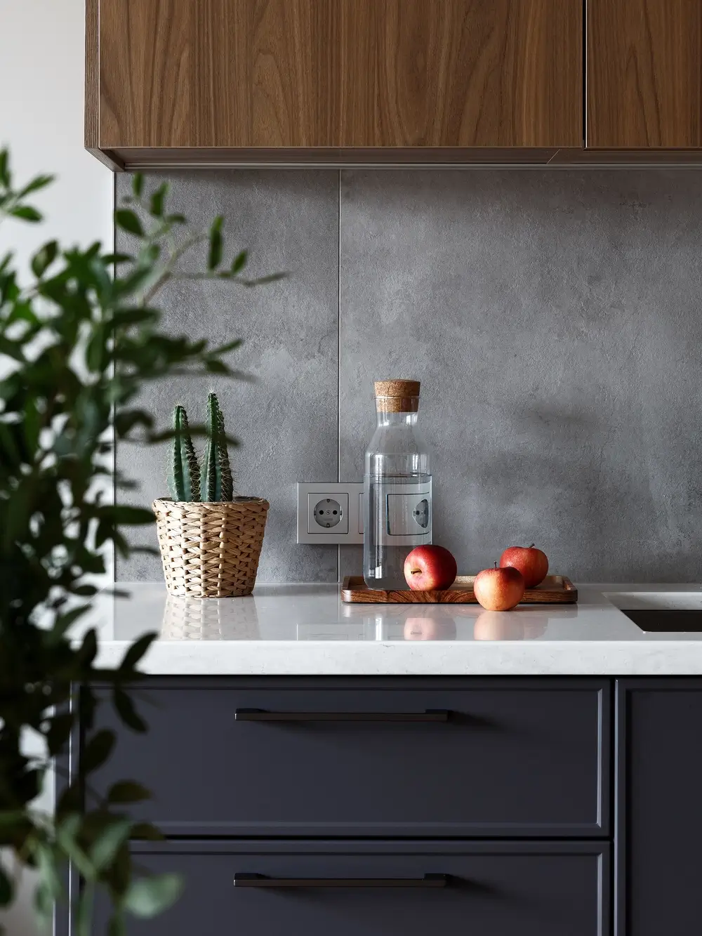
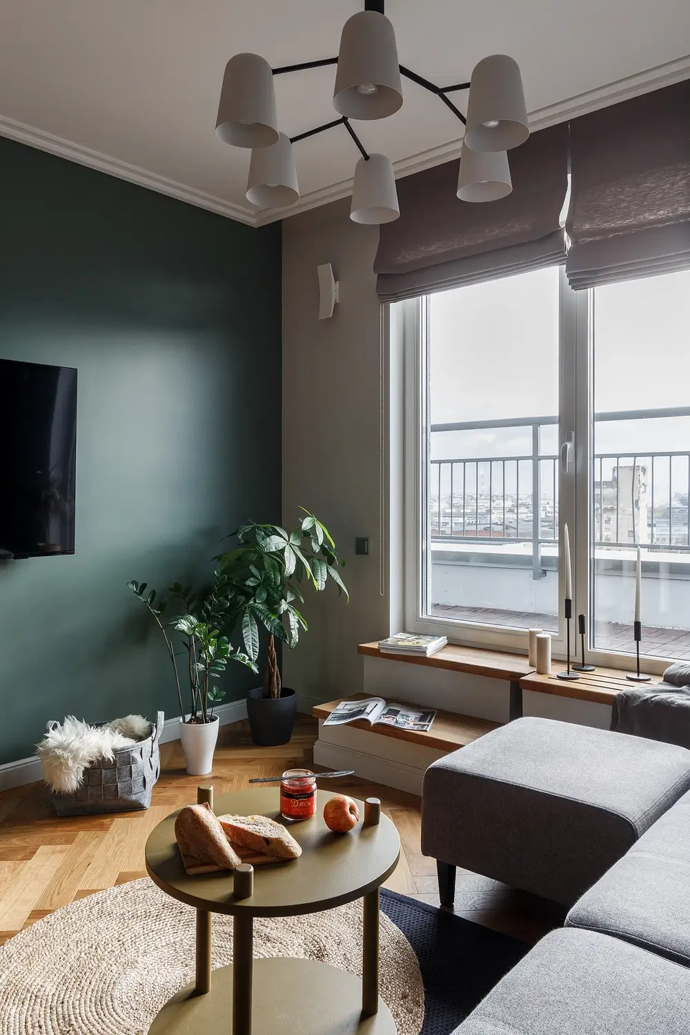
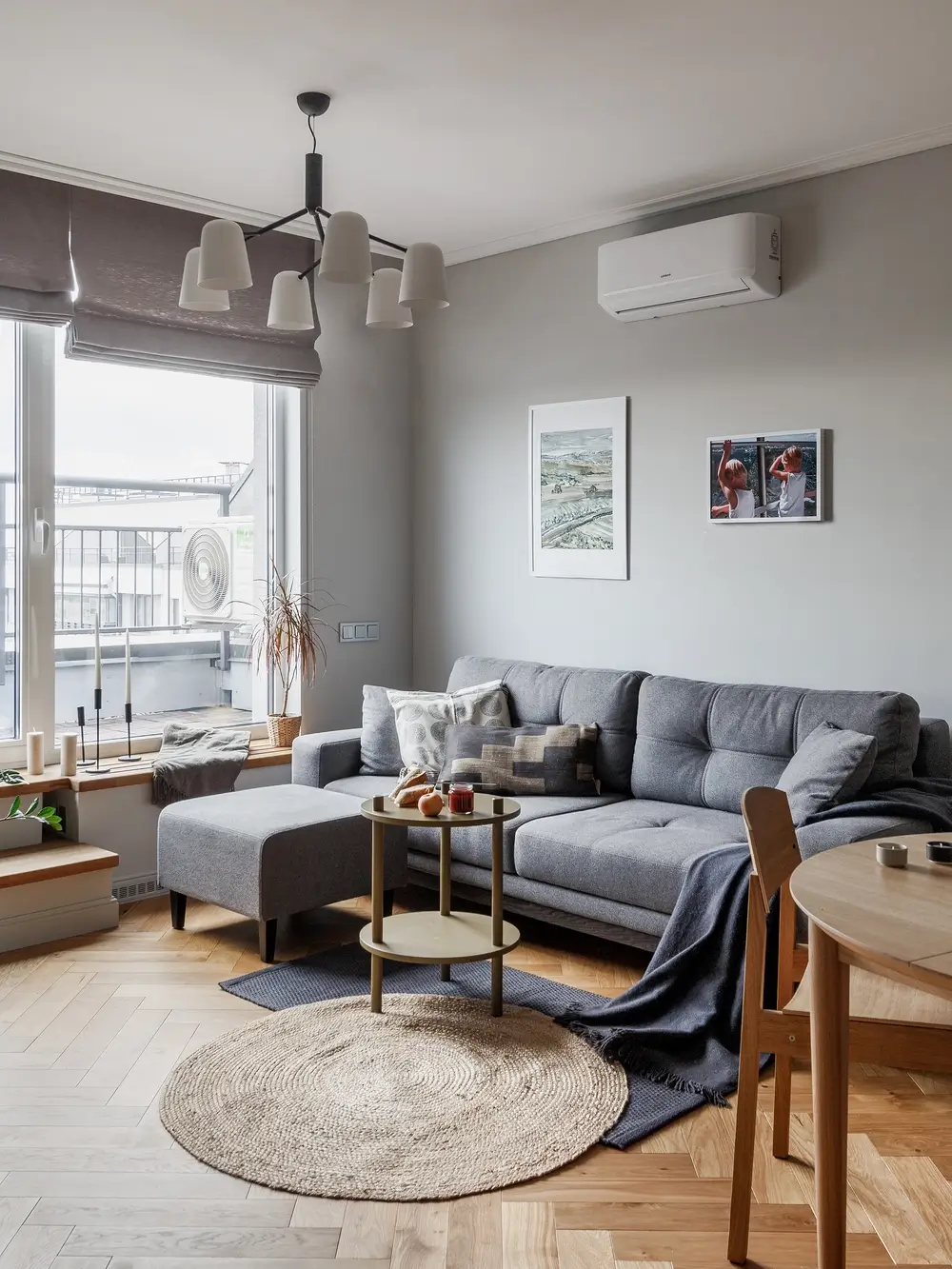
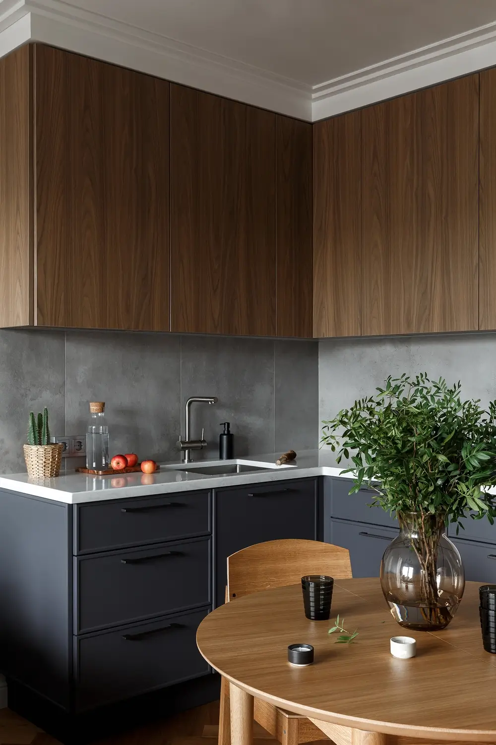
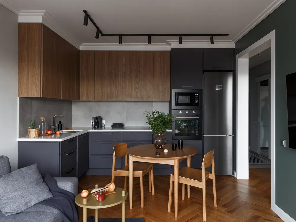
Despite the small size of the rooms we were able to put everything that the client wanted. In the kitchen-living room we have a full L-shaped kitchen along two walls. There is a sofa with a coffee table near a window. Opposite to it there is a TV without a stand not to take the space.
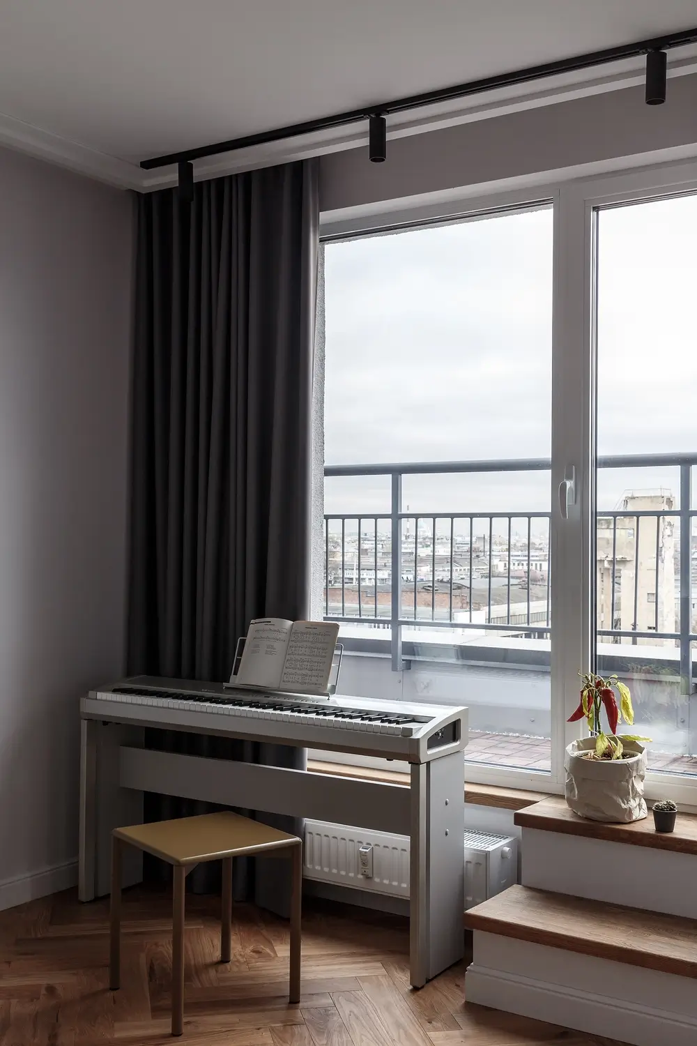
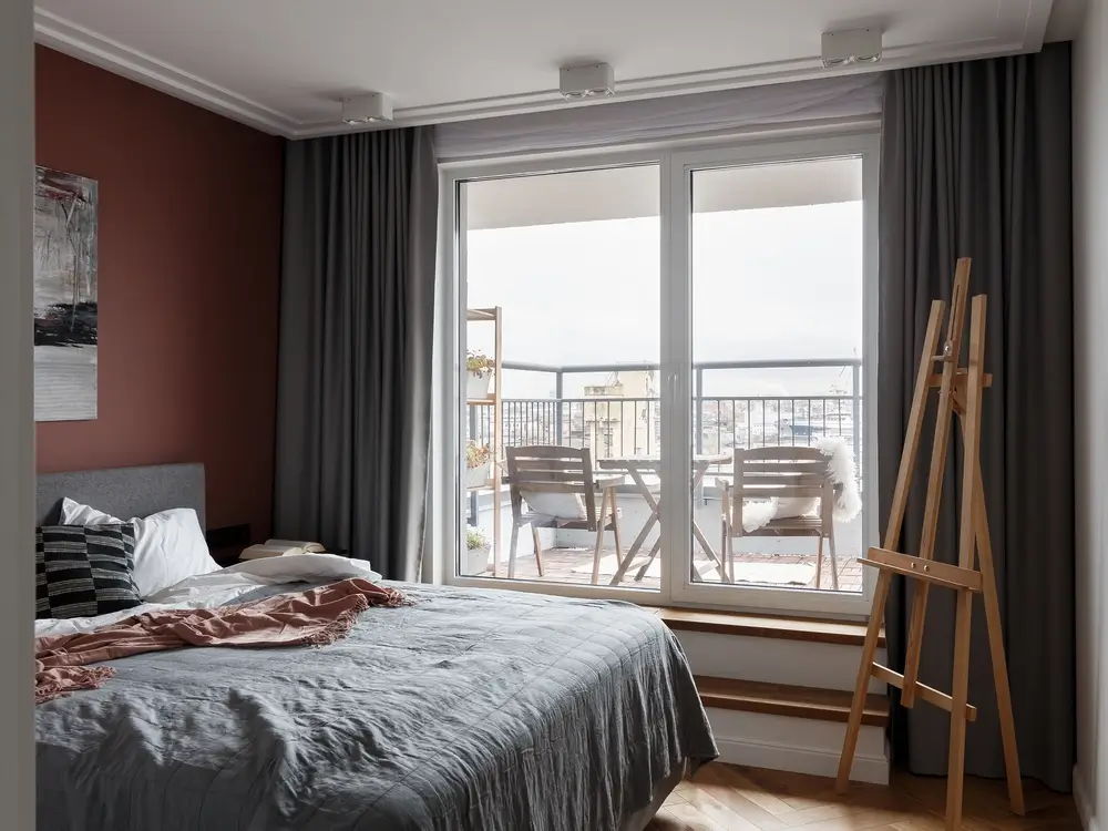
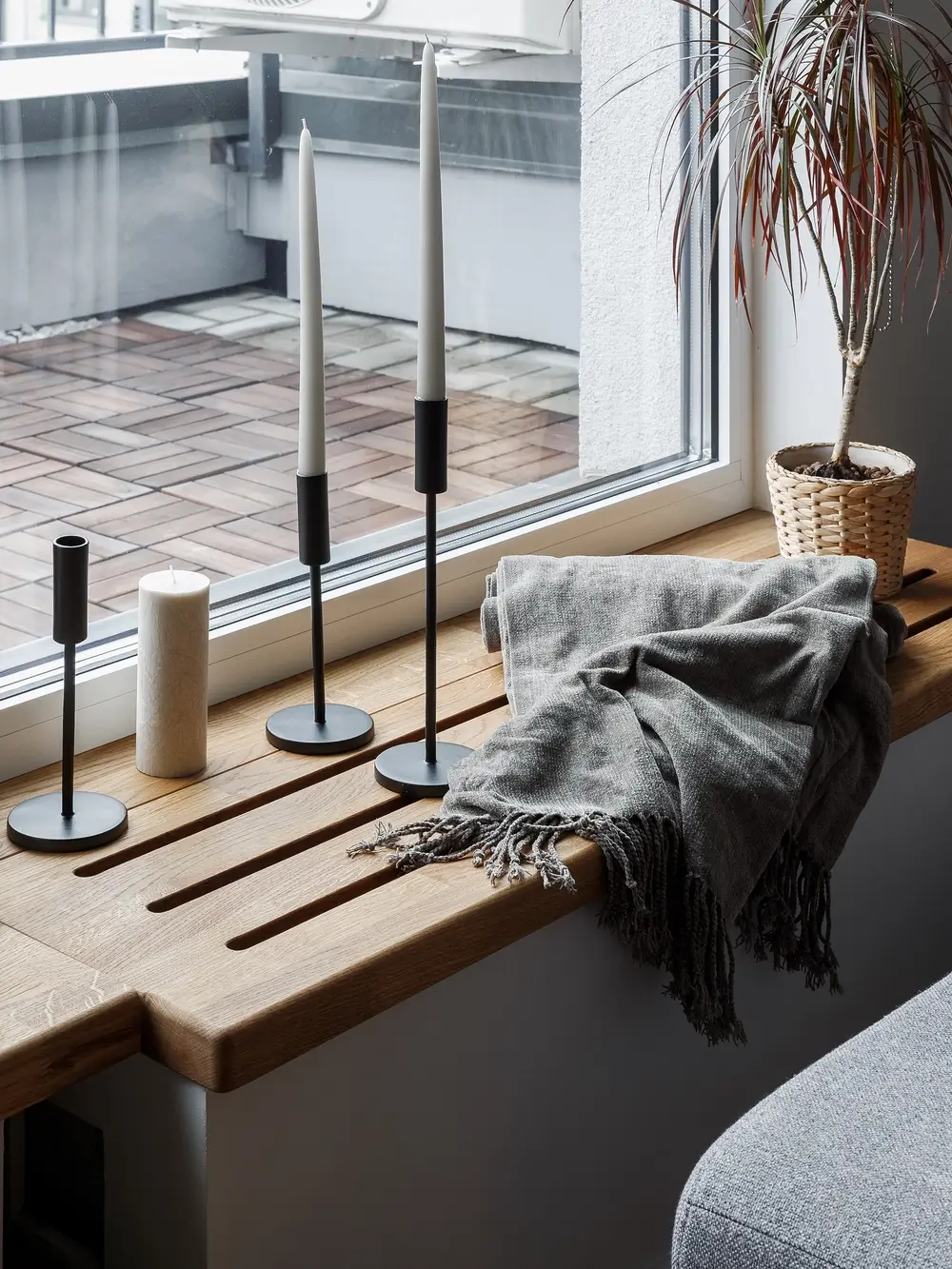
Interestingly, each room has exits to the terrace. Initially the level of terrace was 40cm above the floor in the apartment, so from the side of the room exits to the street was not comfortably high. In addition there was a low radiator under part of the window which we decided not to change, but it did not look very nice and we had to decorate it somehow. So we came up with this solution. The radiator is covered by a wooden stand, the upper plane of which is at one level with the window bottom and thus there is a convenient platform in front of the exit to the street and a little lower in the section of the opening window we added one more step. The width of the bollard is comfortable enough to sit on it if desired.

Scandinavian style and minimalism in the interior. What elements helped us to achieve it
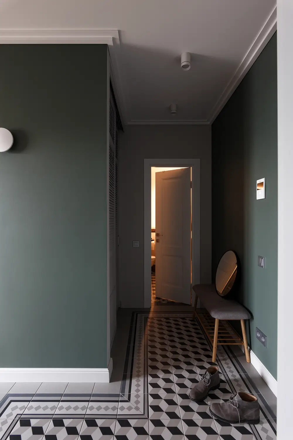
In the hallway at the entrance to the apartment there is a closet for storing seasonal stuff, and there is also a niche for a closet where all the daily wear is stored. Further down the enfilade part of the hallway there are bookcases and closed closets for belongings along the walls.

The bedroom is very simple in filling: a bed, nightstands, and a closet for belongings. But the bedroom has the bonus of an enlarged terrace area under the canopy of the roof, where there is an outdoor table, a shelf for seasonal plants and two chairs for tea parties on summer evenings. Industrial view of the old factory cranes gives a kind of romance to this apartment.

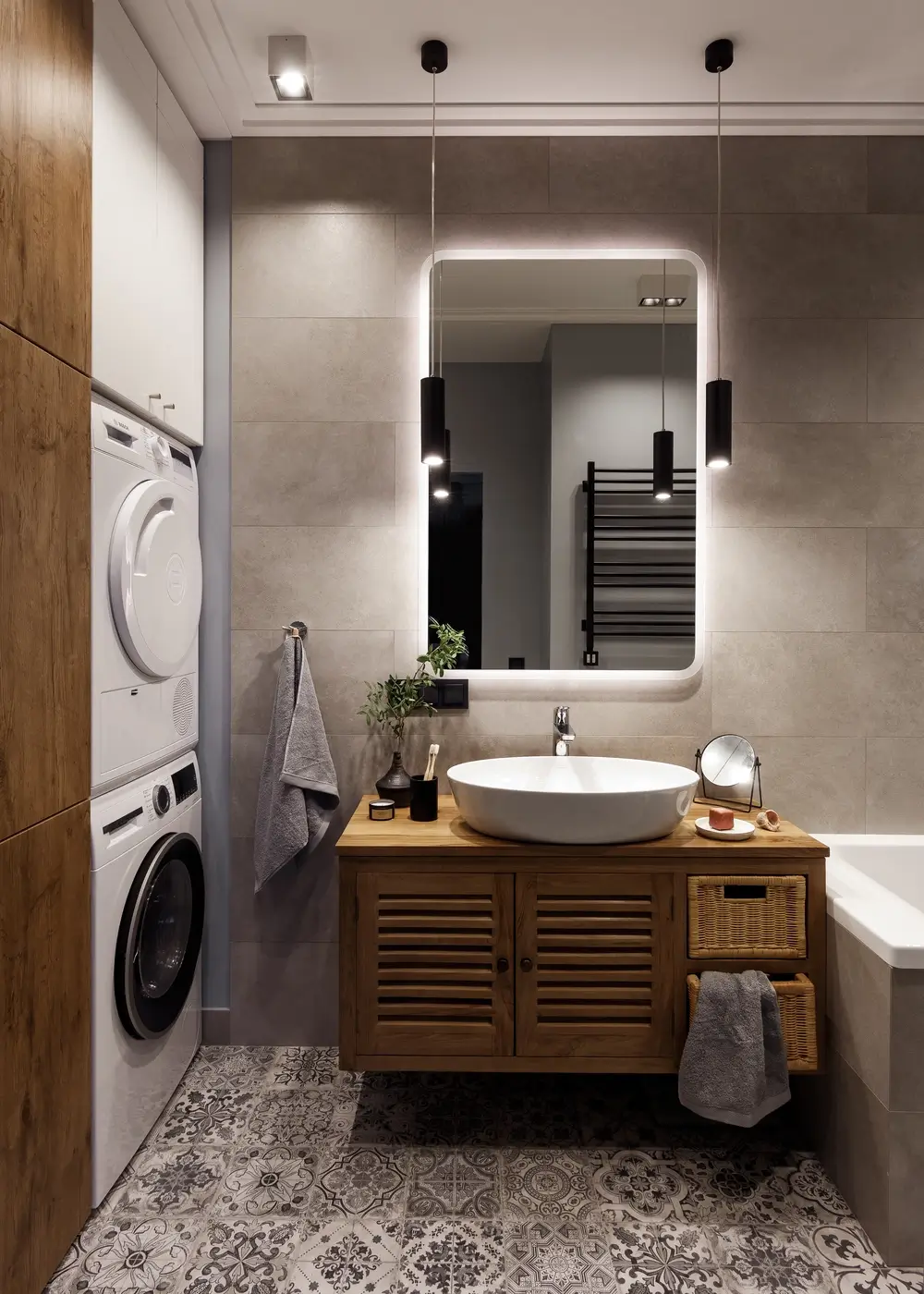
In the niche of the bathroom we placed a utility closet with a washing machine and a shelf for storing household chemicals and an ironing board. At the very top there is a place for a small boiler.
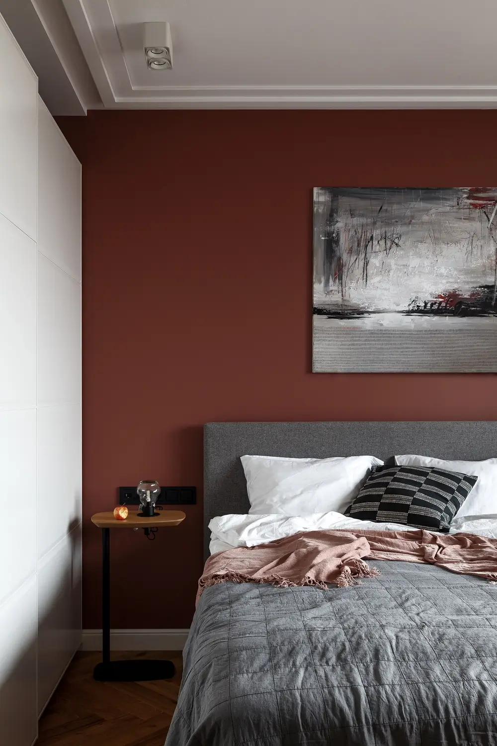
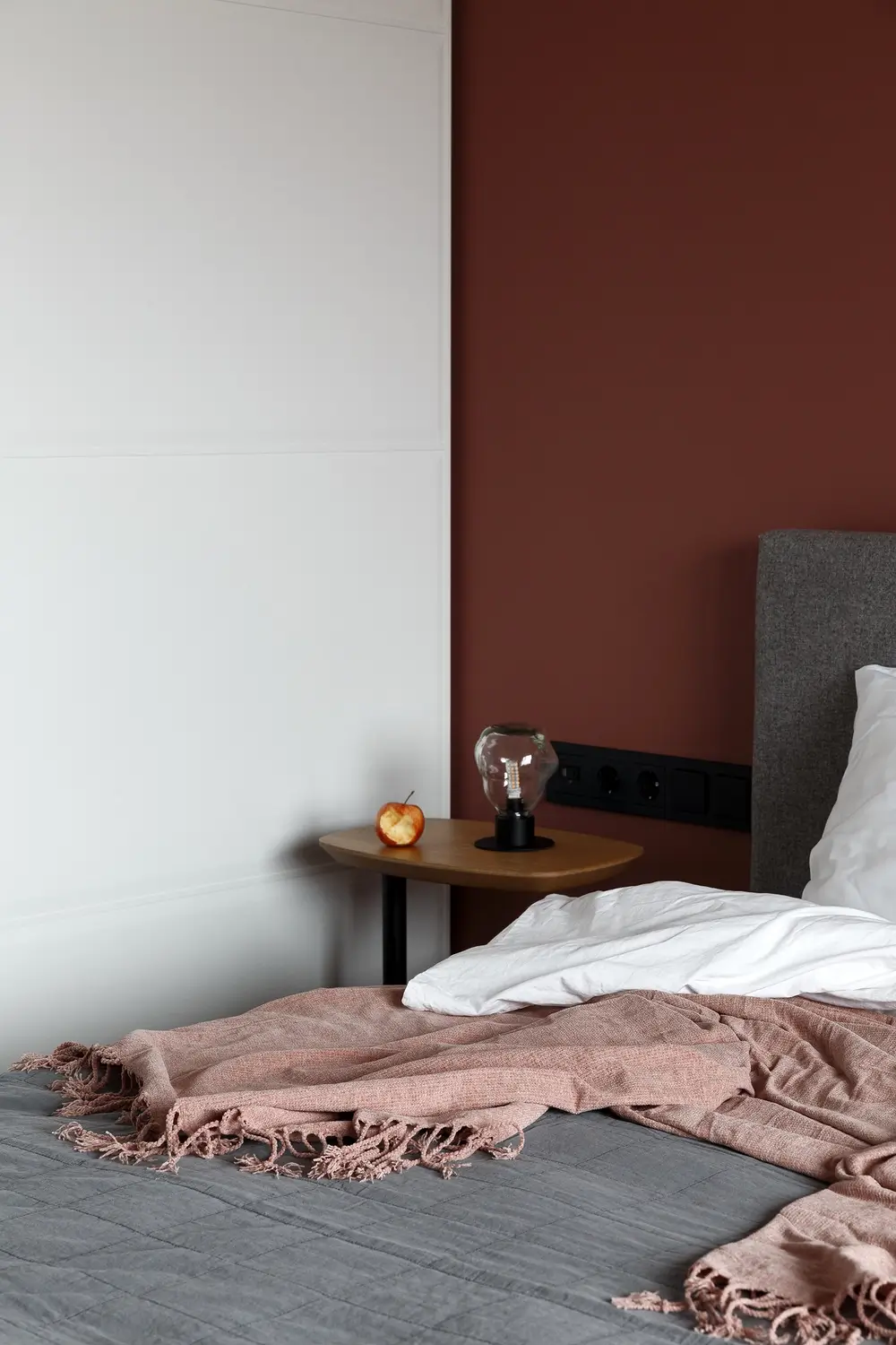
The basic color scheme is gray, but there are nuances. One wall, which goes through the entire apartment from the hallway to the exterior wall is painted in a dirty dark green color, it is not bright, but its depth gives the volume of the room. In the bedroom the wall behind the headboard is terracotta. This color is so nice that there is no feeling of strong contrast with the base color of the walls.
In addition, when viewed from the kitchen-living room, the expressiveness of the perspective is emphasized by this color of the bedroom wall. And when viewed from the bedroom, the kitchen unit with the round dining table acts as the center of the composition. The floor color is natural, but it is laid in a special pattern.
Because of the standard for new houses, small height of the ceilings, we used small lamps. Chandelier hung only in the living room in the area of the sofa, in all other rooms are spot, track fixtures and sconces.
Perhaps at first eyelook this apartment is very simple and unlike our other projects. But after a detailed review there are a lot of little things, which we were able to assemble into a single picture and as a result get a very comfortable apartment.


