Light tones in the interior
The apartment is located on the top floor in the historical center of the city with great view of the green square. The owners are a young couple who do not have children yet but have two Westhailand White Terriers. At first they rented this apartment, and then decided to buy it and make renovation of the apartment. The feature of the apartment is a large number of windows.
The main wish of the clients was to get rid of the long corridor with two windows and the kitchen. The hallway had a southern orientation, so it was the brightest room. But we wanted to decorate it and get:
- a comfortable and bright living room;
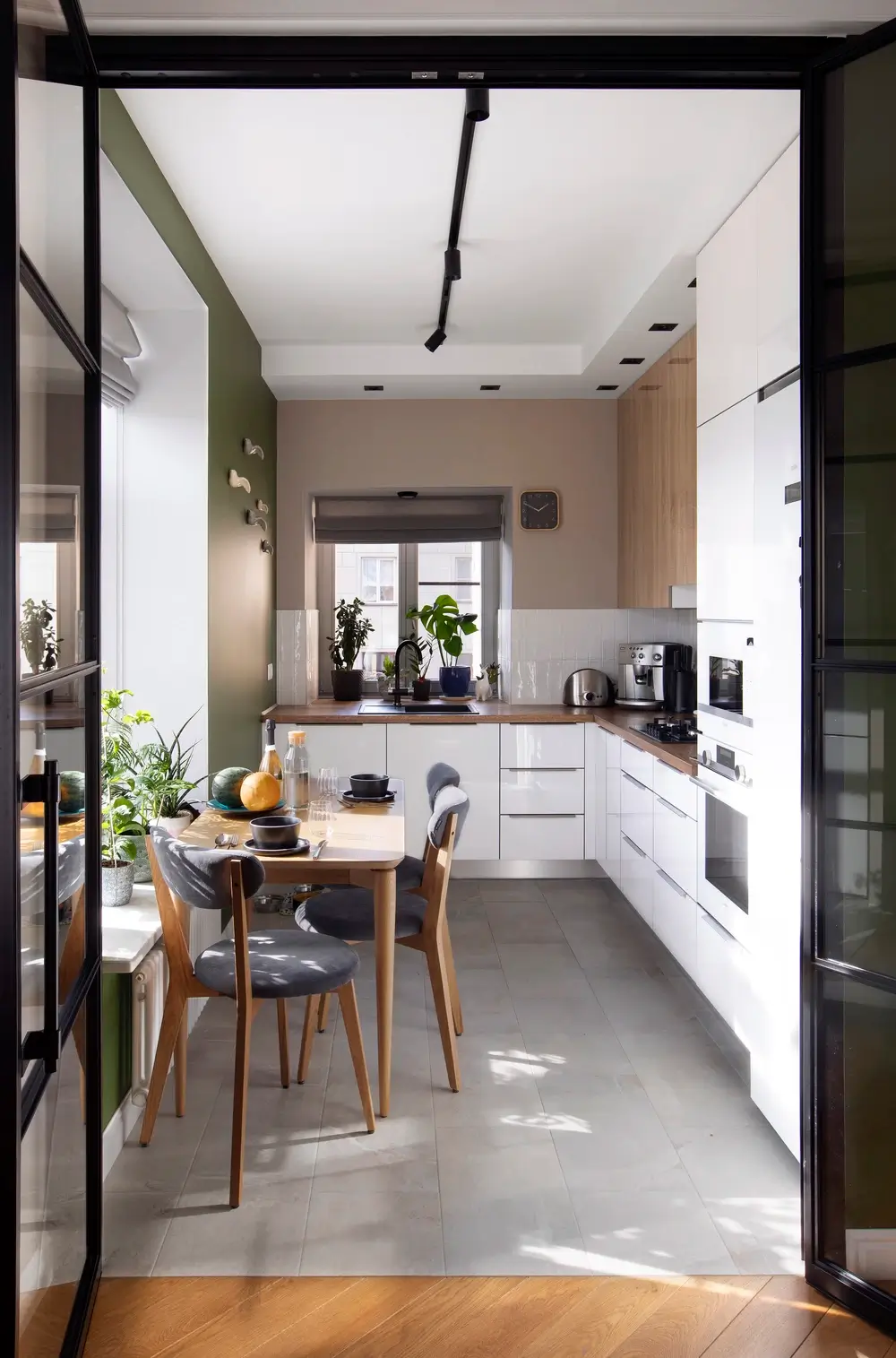
- the kitchen must be bright, with a wooden worktop;
- a bedroom with a big bed and a built-in closet;
- a separate office (in the future – the nursery);
- a dog house in the dressing room.

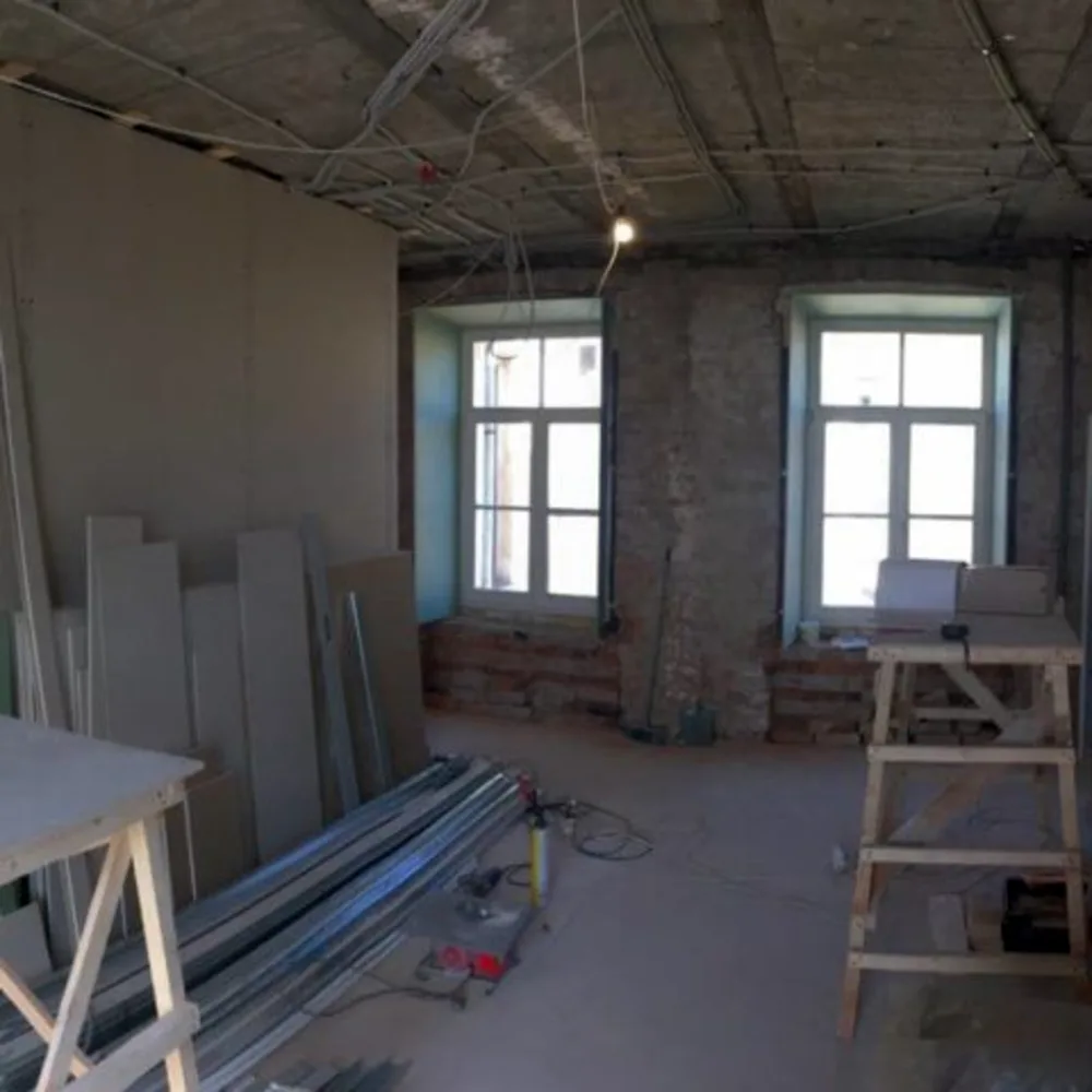
As is usually the case with apartments in the old stock, we had to make a redevelopment: completely remove the old walls, floor, ceiling, make new partitions, change of plumbing and radiators. And even repair the roof.
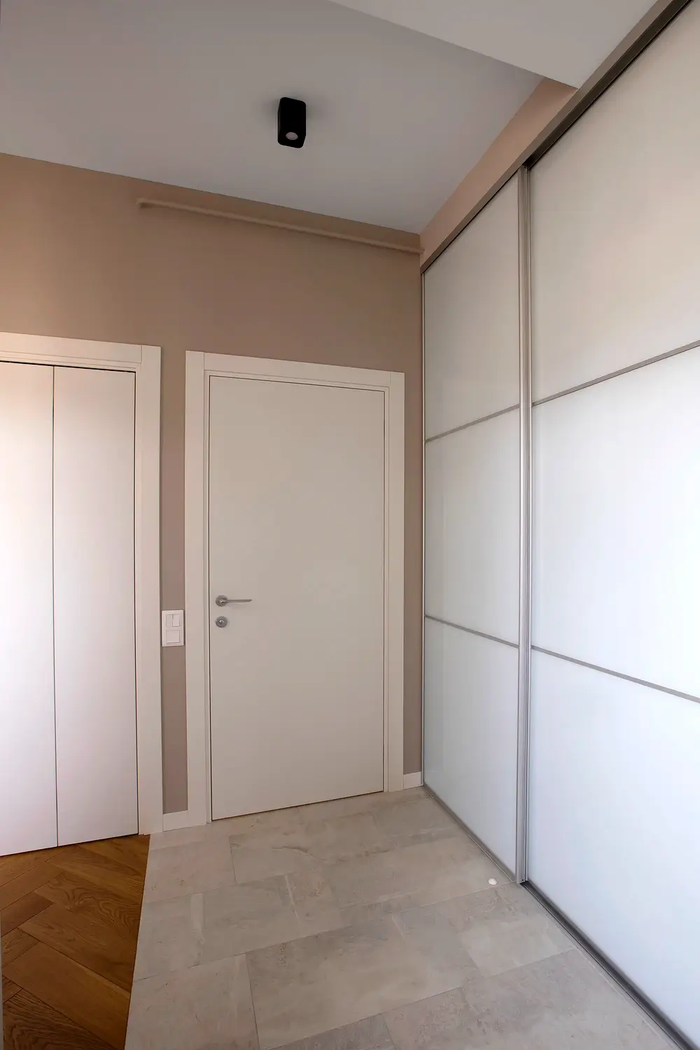
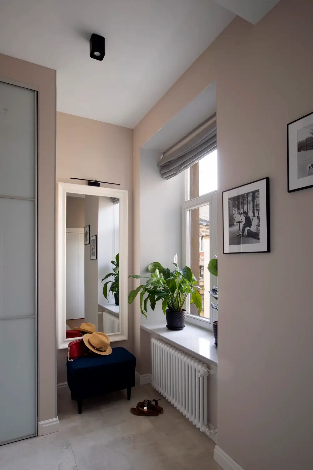
Initially, this apartment was a classic corridor-type layout with a small kitchen right in the corridor. In the process of working on the project, we have long thought about the proper placement of rooms. It was important to have a separate kitchen and a spacious living room. But we also needed a walk-in closet and a storage room. As a result, in addition to the closet for items in the hallway, we made a separate room for the washing machine and dryer, boiler and storage of household items.

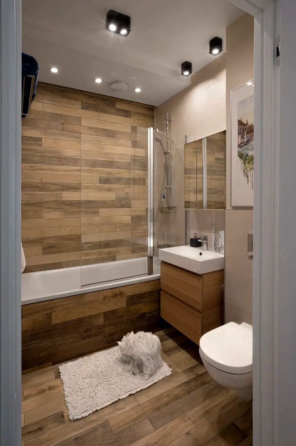
The bathroom is designed combined not to lose space, and next to it we put a small dressing room. Inside the bottom of the closet we provided space for a dog kennel with an entrance from the hallway to allow the dogs to enter the house directly from the hallway. Unlike our other project, where the main customer request was to equip a dog washroom at the entrance to the apartment, here we did without this technique. Although technically it was technically possible. But the owners preferred not to waste space. In addition, dogs of this breed can also be washed in the bathtub.

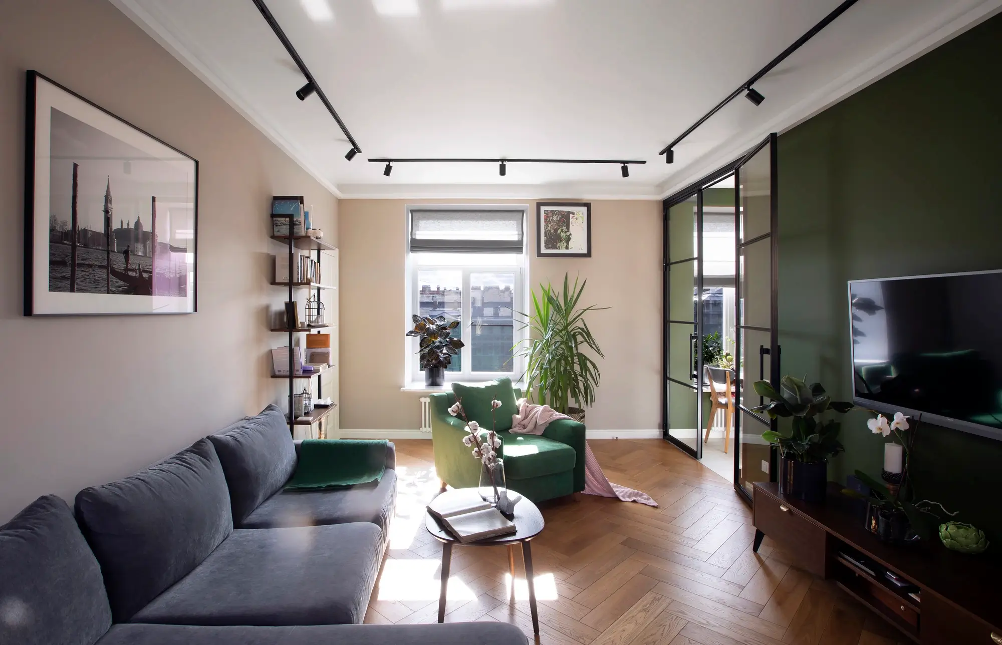
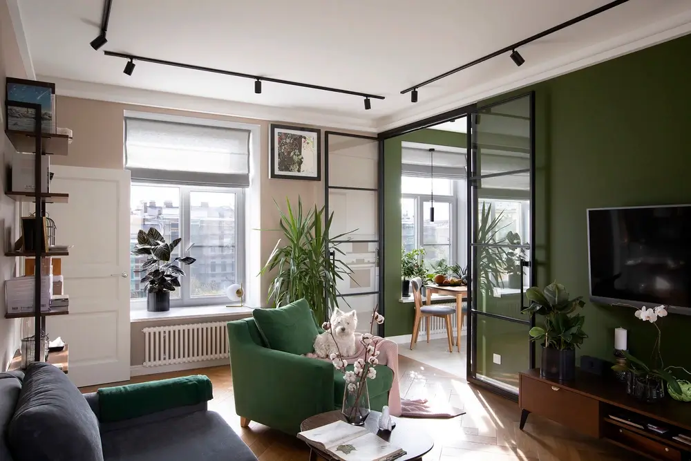
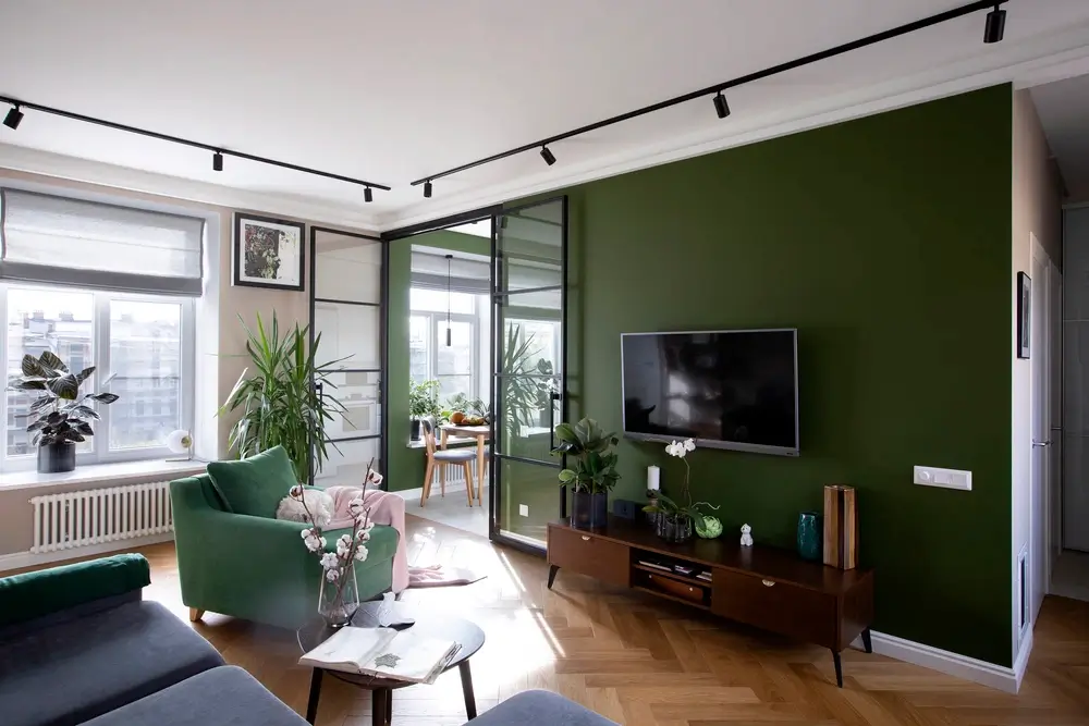
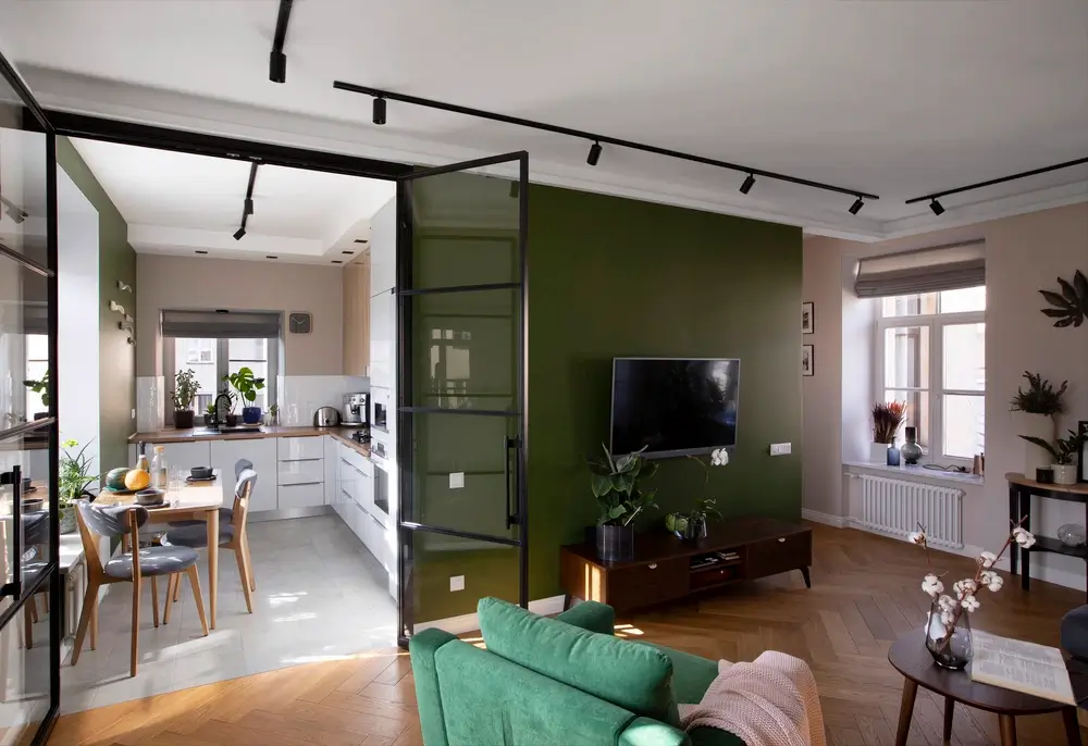
We have just got rid of the corridor and made a big living room from which it is able et to the kitchen, bedroom and office. The kitchen is separated from the living room with a glass partition: thanks to this solution, the living room and kitchen are perceived as one space. But if desired, the glass door can always be closed, so that cooking smells do not enter the living room. When designing the “wet” zones we were guided by the layout of the apartment from below: it turned out that their kitchen is much bigger and this allowed our kitchen to increase without violating the sanitary standards.

An interesting solution: a sink by the window in the kitchen
About the kitchen, the customers had a wish: to make the sink opposite the window – an interesting solution that allows you to enjoy the beautiful view from the window while washing dishes. They also ordered a wooden oak countertop. Perhaps in terms of operation it is not the best solution, but the customers were not embarrassed by the fact that every year the countertop will have to be coated with oil.
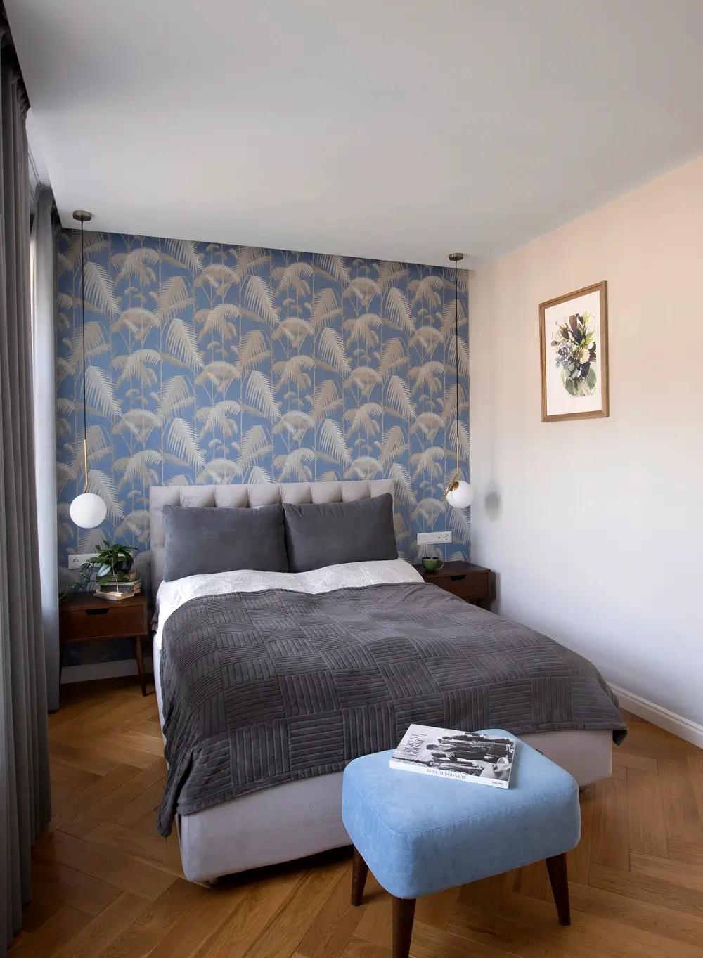
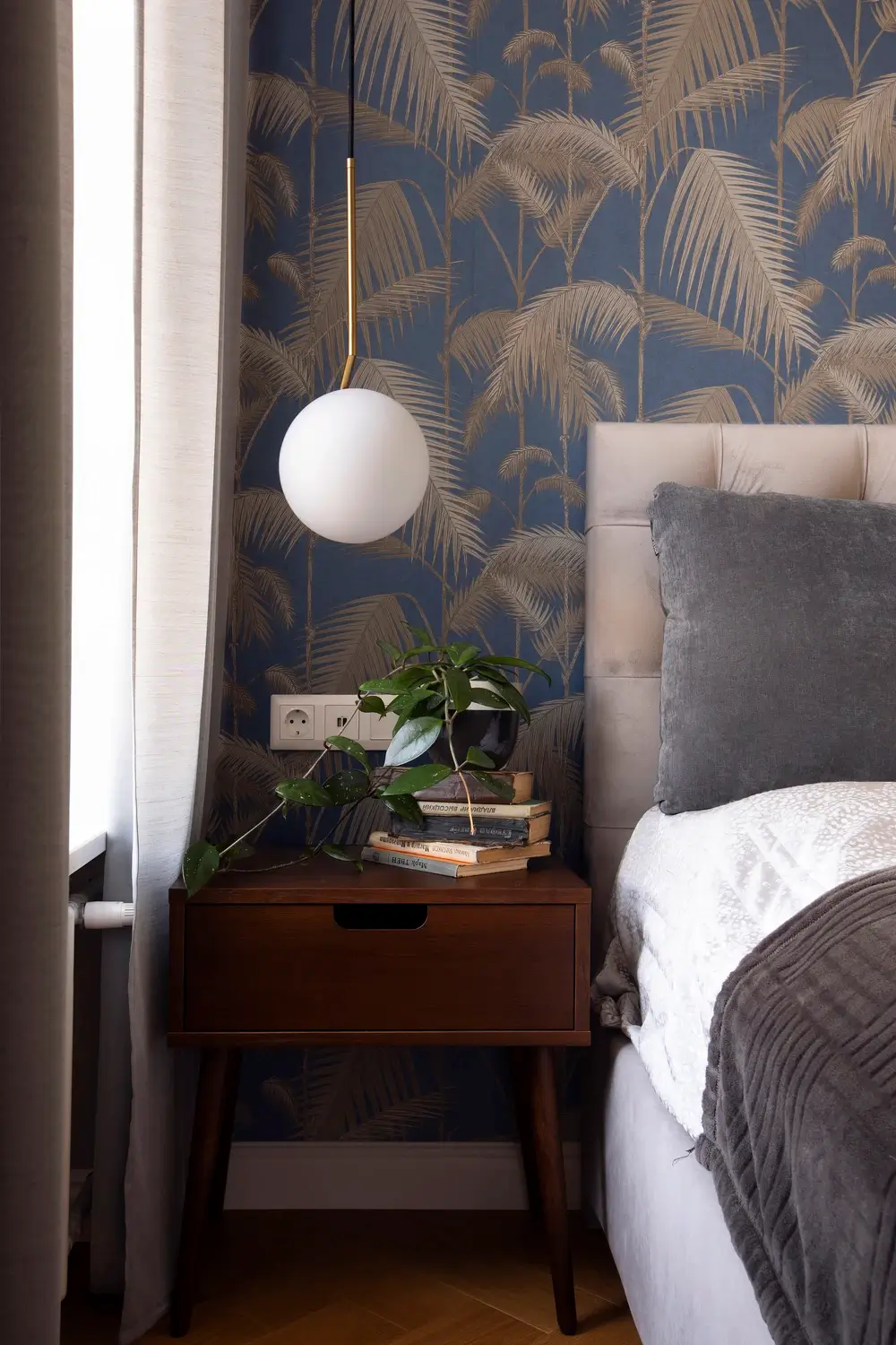
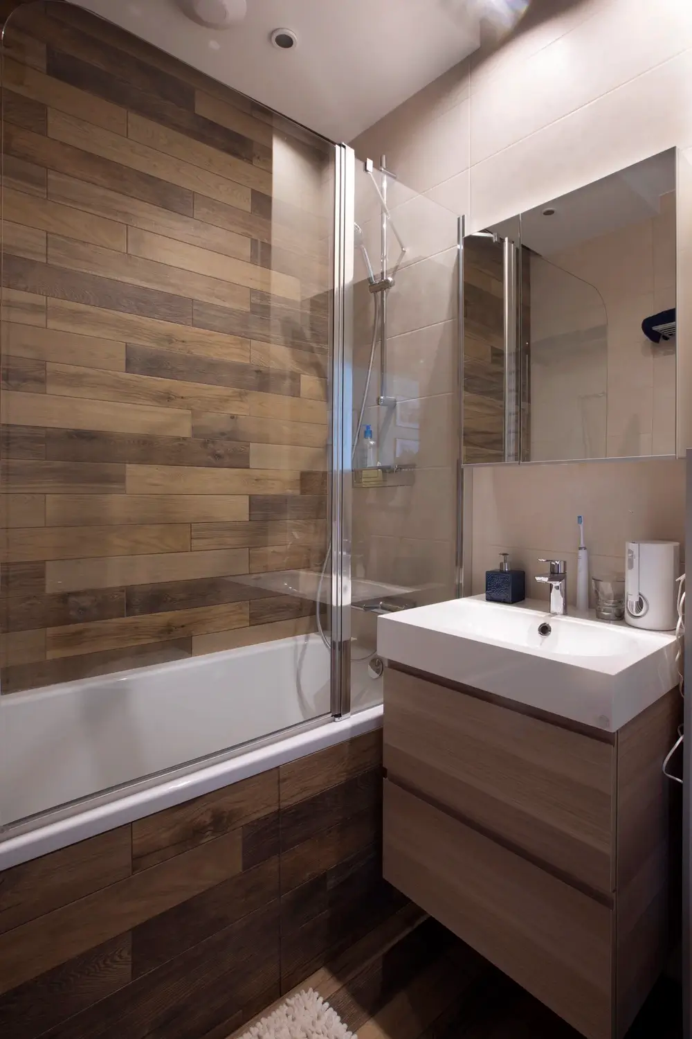
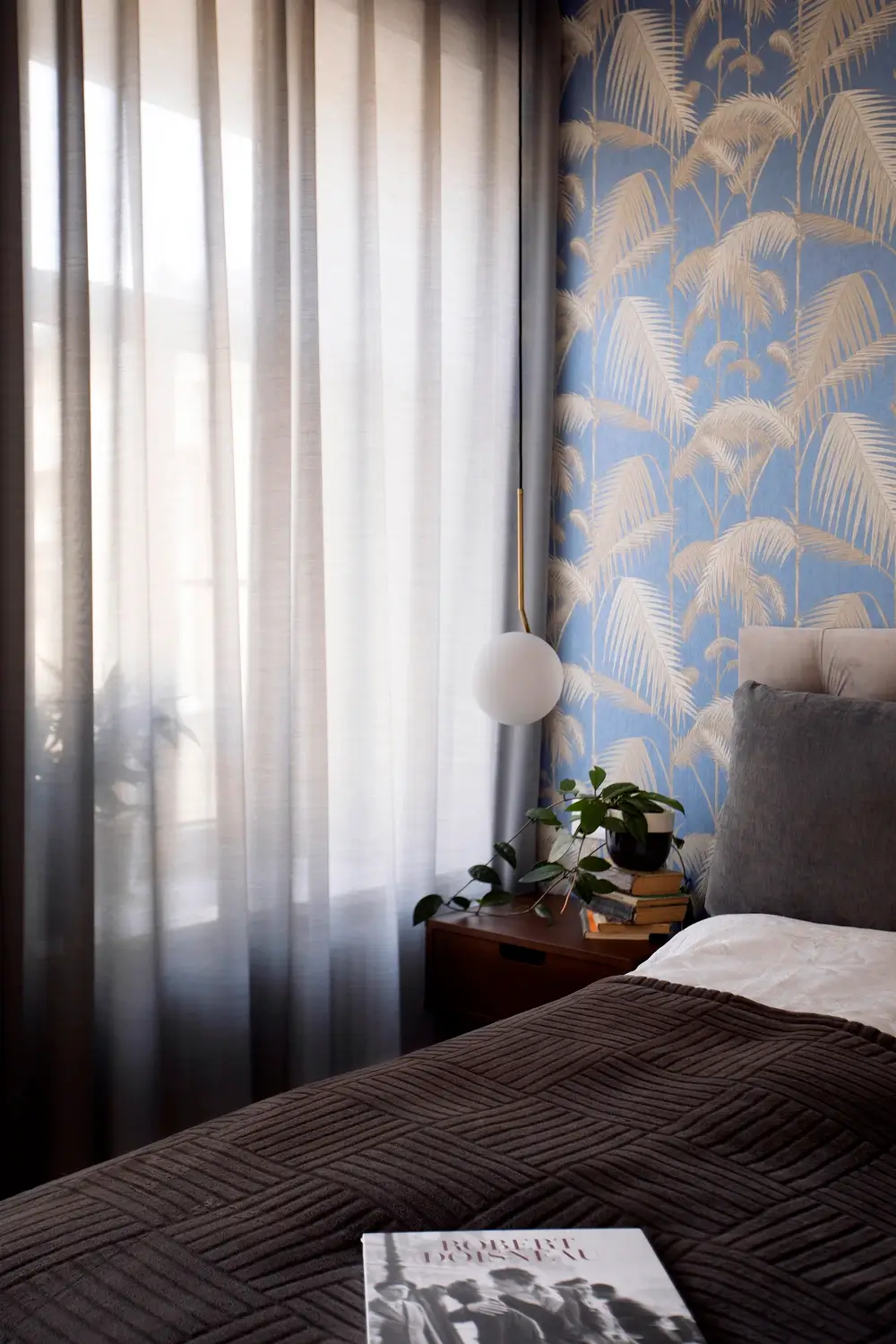
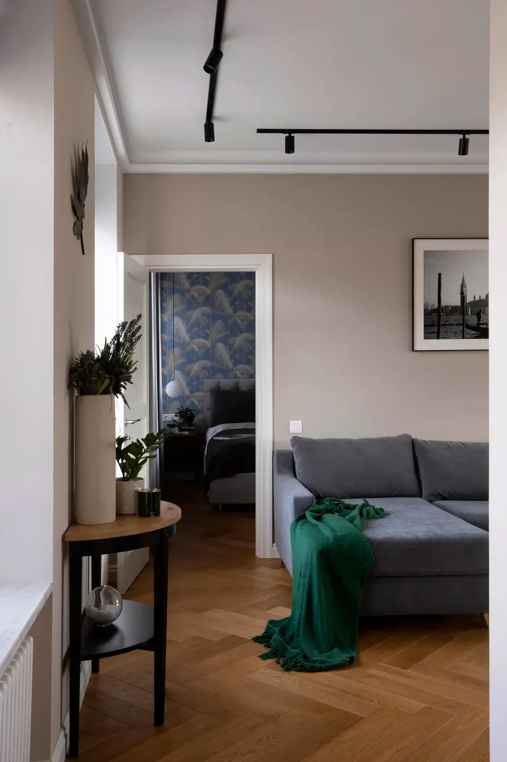
The bedroom and cabinet ade of almost equal size. The bedroom has a bed, two bedside tables and a built-in closet in the niche. The decoration was made of simple but high quality materials. The walls are patly painted, the floor is covered with parquet. In the bedroom, as an accent pasted wallpaper with prints. In the bathroom, the walls are decorated with wood tiles and waterproof paint.

Light shades in the interior
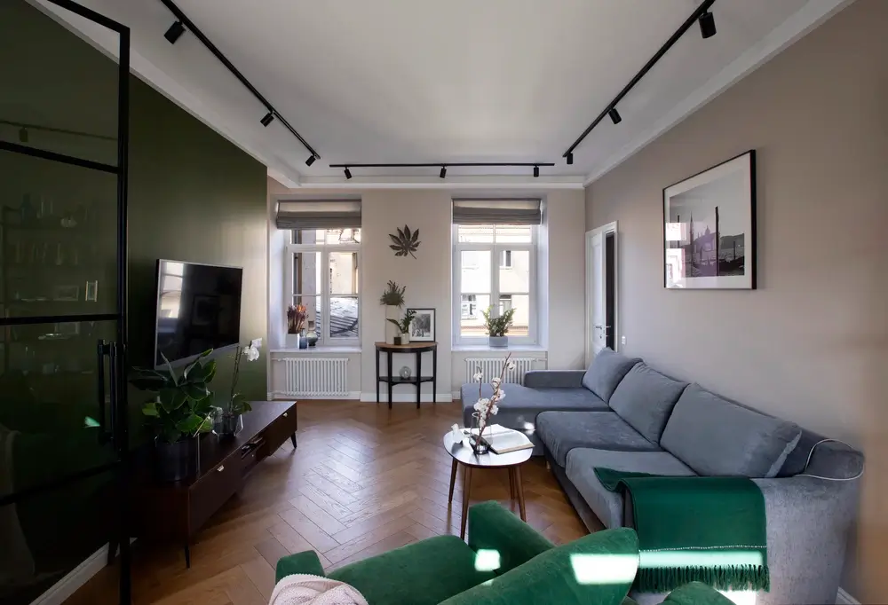
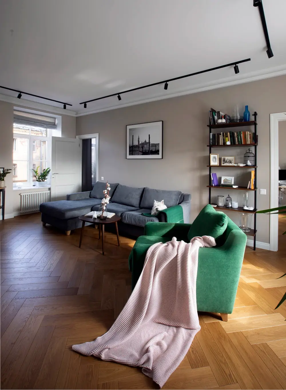
Unlike our other projects done in dark colors, here we went to the light side. There are no our favorite dark gray shades. But we did add a green accent. The owner is passionate about raising houseplants, so the green shade was chosen for a reason. We painted one wall in the living room and the kitchen with a deep green color. The other colors were chosen as neutral as possible: light gray and soft beige. In the bedroom, the headboard is decorated with wallpaper with a pattern.
All the furniture has laconic forms, without unnecessary decorations, in the style of Scandinavian interiors and lofts. For the living room we chose a gray sofa and a green armchair – it plays with the green wall behind the TV. There are also a few console tables to place potted plants – they create a special, harmonious and comfortable atmosphere here.

The bright apartment has been obtained through the use of modern solutions
The client wanted to avoid using pendant chandeliers for lighting. We used the following types: track lighting, overhead, hidden lighting. All the tracks were in black, so that they would stand out against the white ceiling and emphasize the geometry of the room.
Because of the large number of windows and the fact that the apartment is located on the top floor, there was the issue of protection from the sunlight. In the end we used blinds in the living room and kitchen and classic tulle in the bedroom.
As a result, we were able to get a very bright apartment due to intelligent redevelopment and without violating the standards. In such a small area we have placed a separate utility room, a bedroom, a cabinet, which in the future will become a nursery, a comfortable kitchen-living room with a sink in front of the window and a dressing room with a built-in kennel for two dogs. All this allowed the space to be comfortable and convenient for living.


