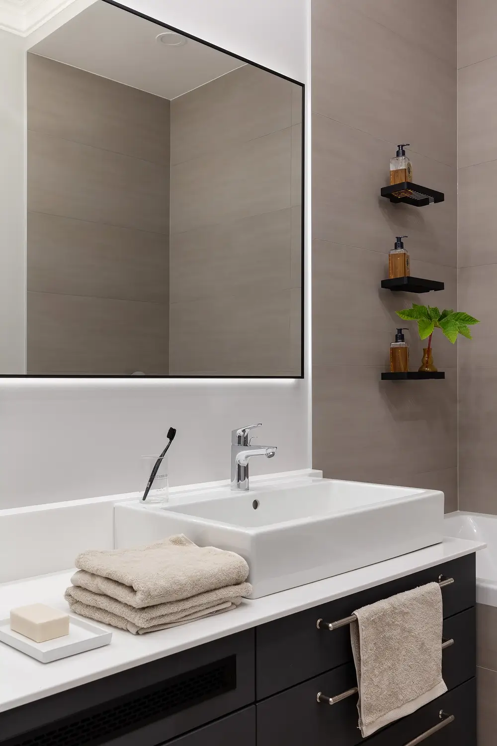
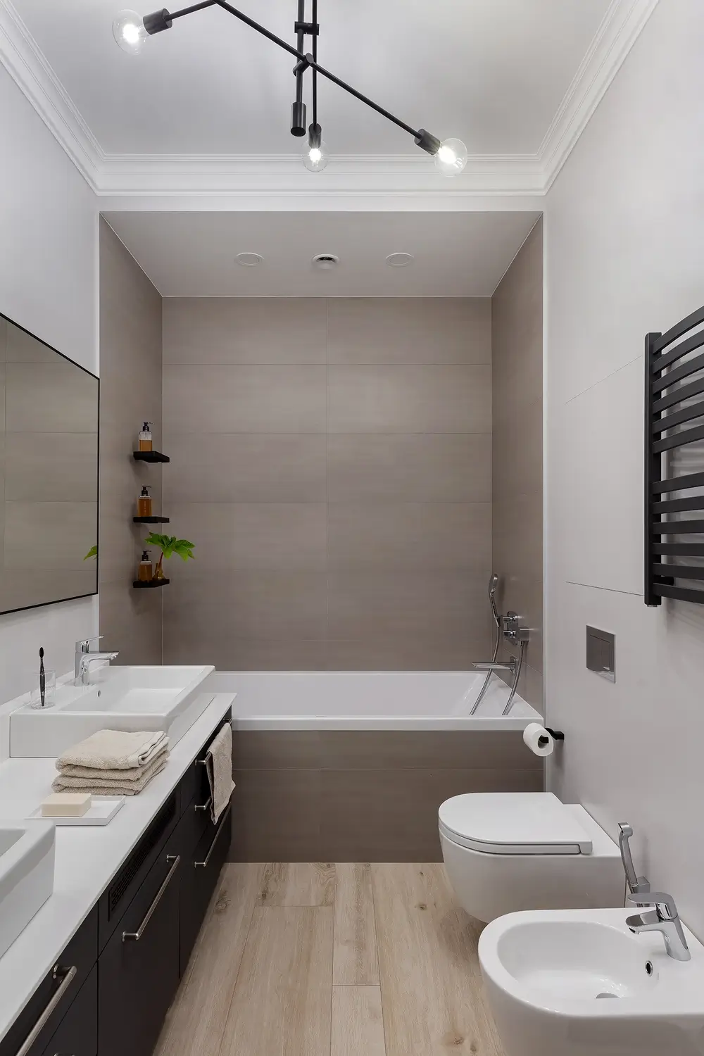
Apartment in modern scandinavian style
This apartment in our portfolio is the largest in terms of the area and the longest in terms of the process of the construction. It is Scandinavian style, light, but with dark accents, and completely the way we and the owners planned from the very beginning.
The apartment is located in one of the central streets of St. Petersburg – on Rubinshtein Street, in the house where Dovlatov (the famous Soviet journalist and writer) has been living . The young family did not bothered by the location in the noisiest and most crowded street of the city, since the apartment is located at the back of the building, on the top floor, and part of the premises were oriented to the opposite side of the street.
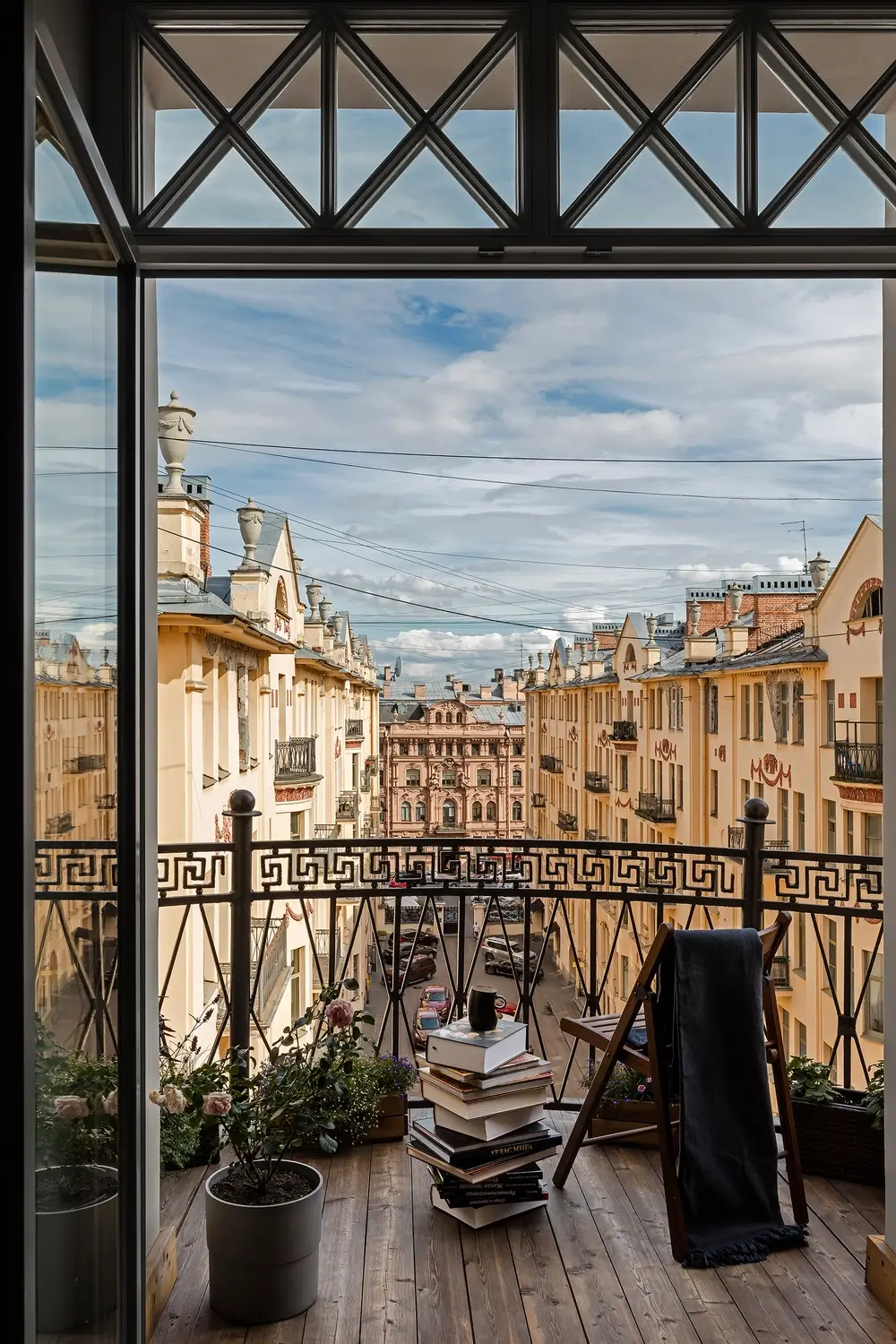
The apartment was chosen for a reason. The clients were looking for a property where they could make a French balcony overlooking the rooftops of the city. The area of 250 square meters allowed for a full range of necessary rooms with a reserve for future addition to the family, and an additional back staircase gave the opportunity to run through the variations.
We were faced with the following tasks:
- to make a large kitchen-dining room and living room with a French balcony
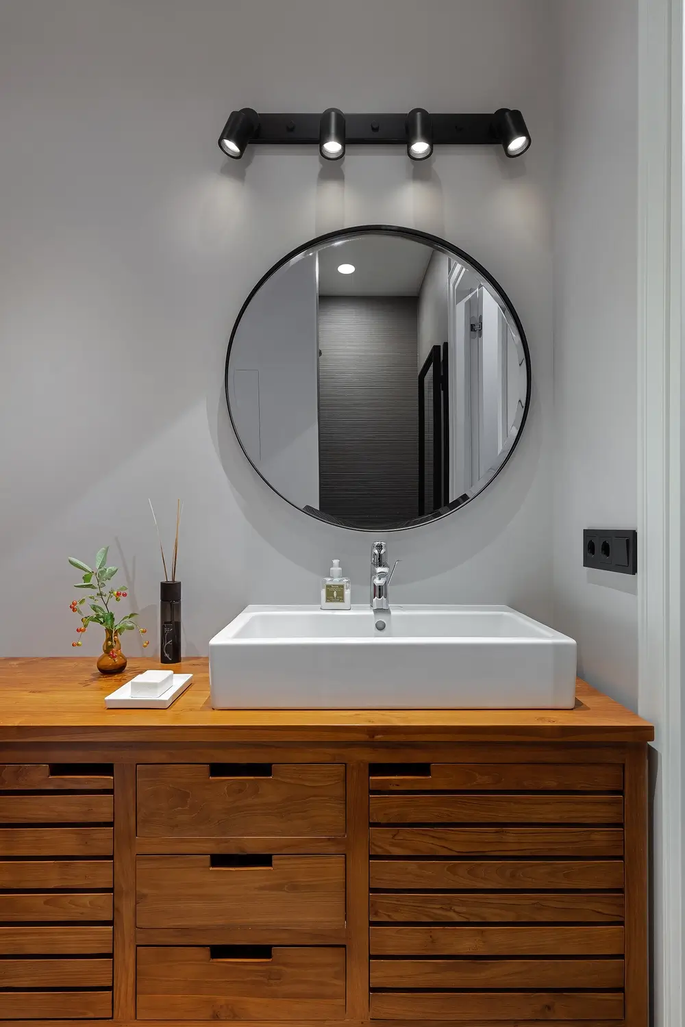
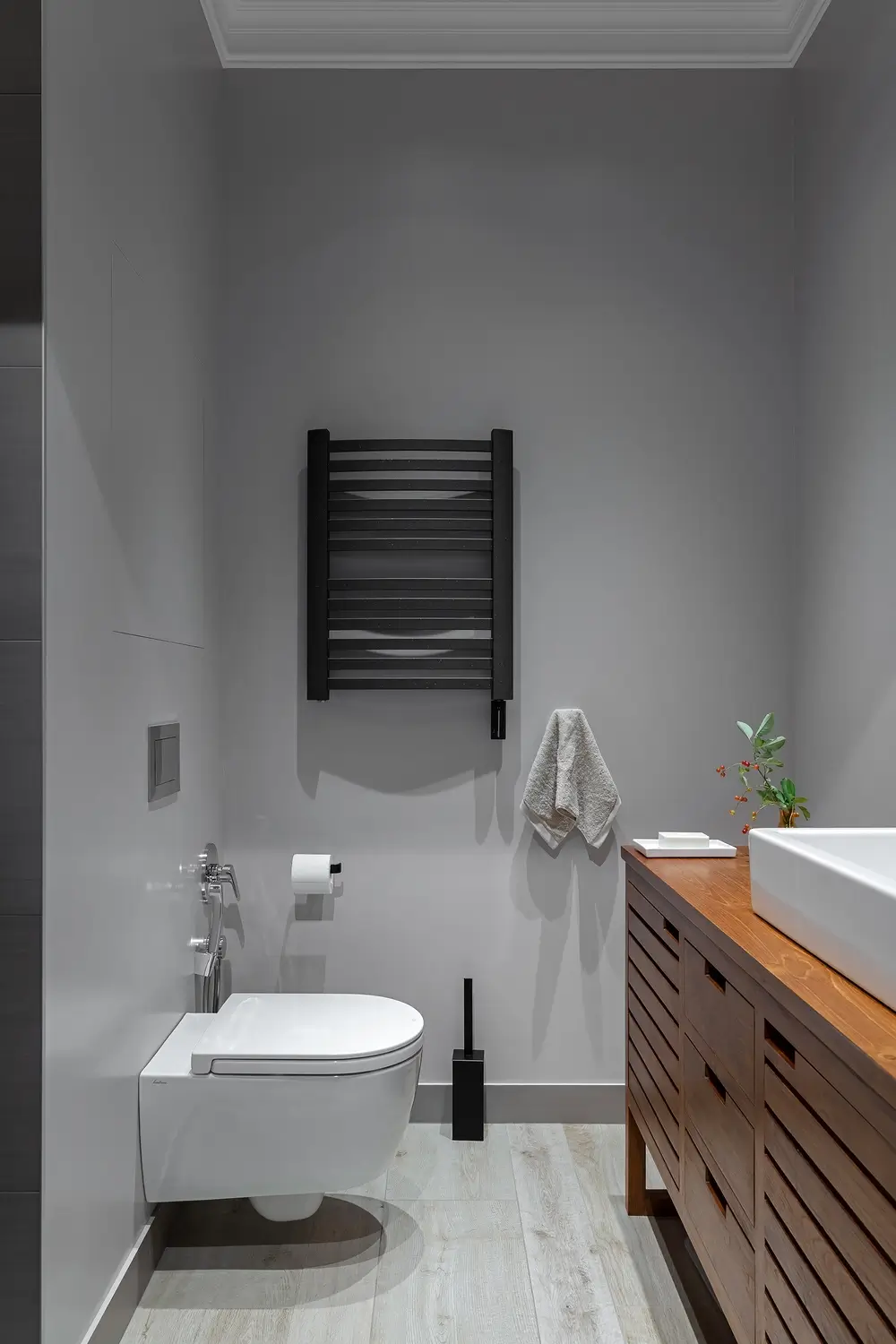
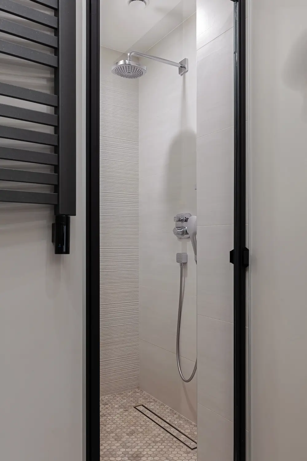
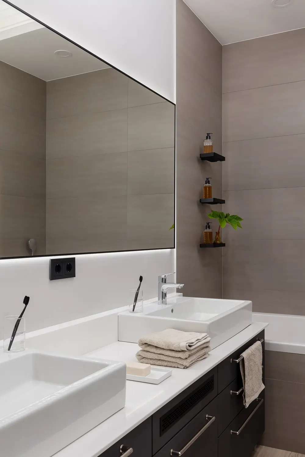
- to locate two bathrooms (one in the bedroom and one guest bathroom)
- to provide a separate cabinet
- to make a nursery and two guest rooms (in the future also children’s)
- do not forget about the large household room.

Scandinavian style apartment design. Choosing a style
The owners – it is a young Russian-Swedish family. Therefore the fact that the design of the apartment in the Scandinavian style would be a priority.
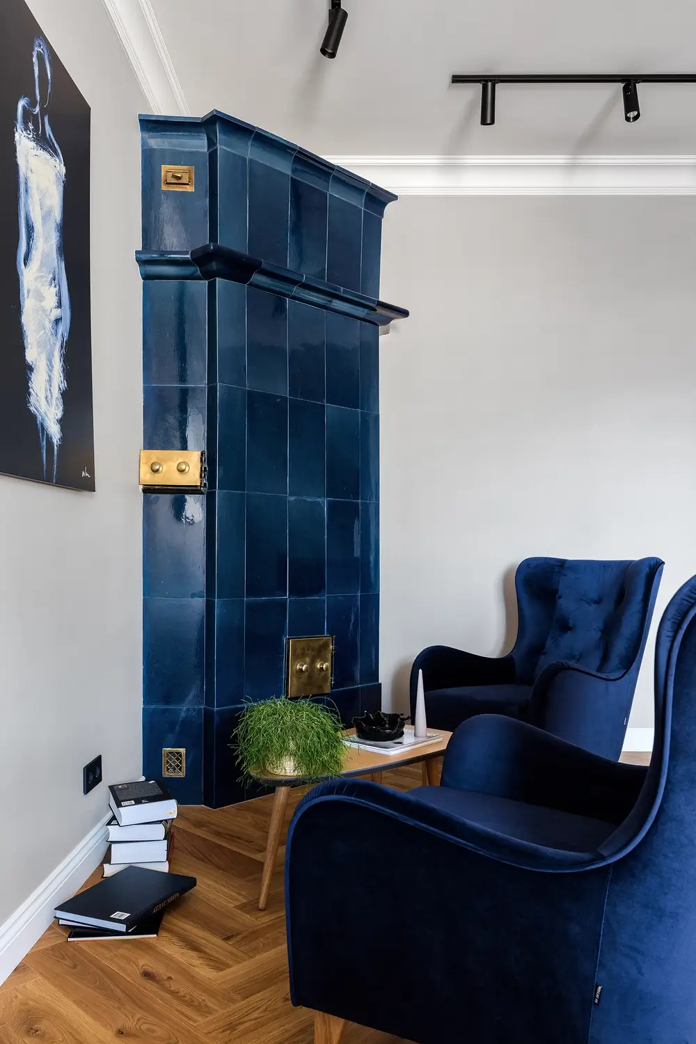
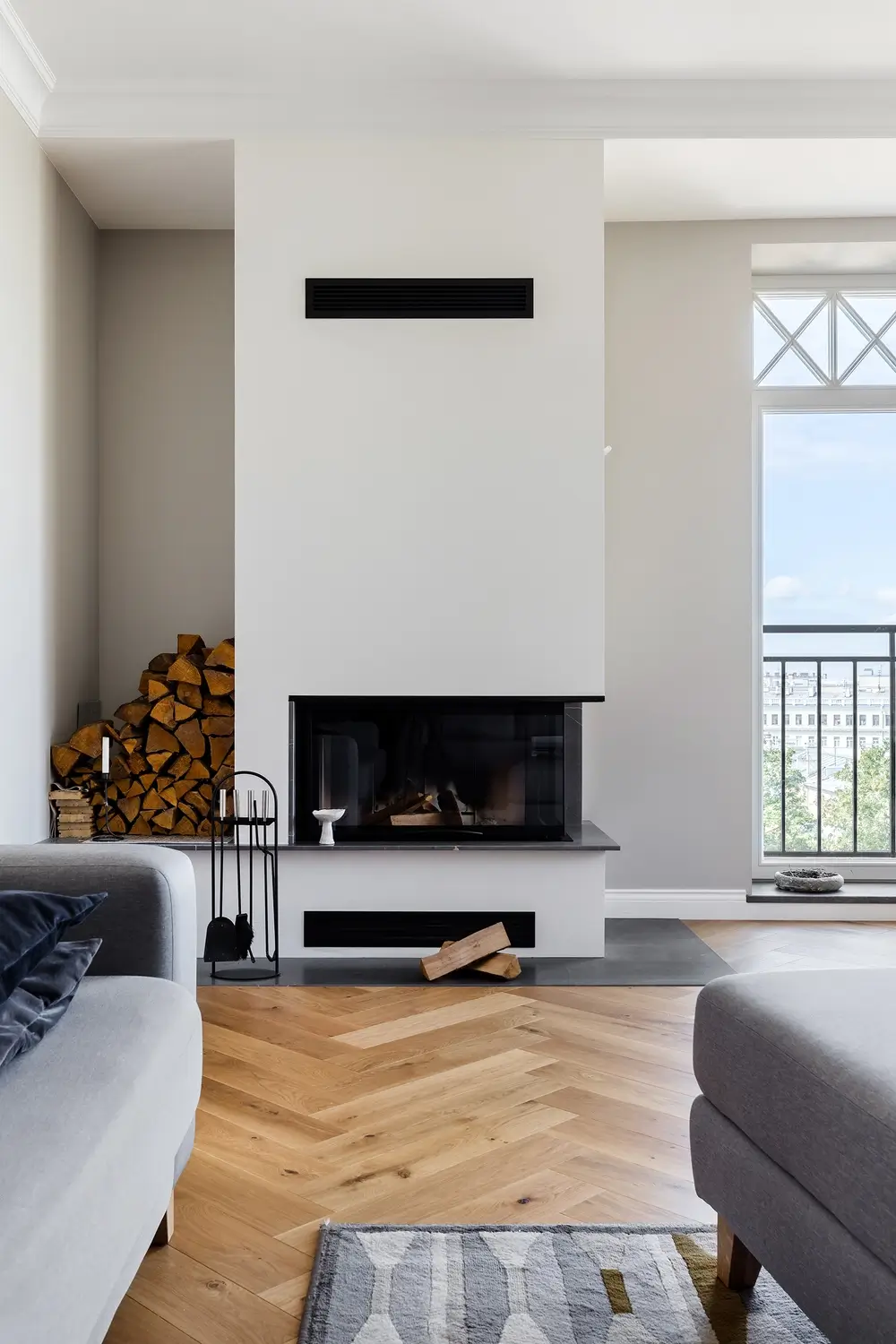
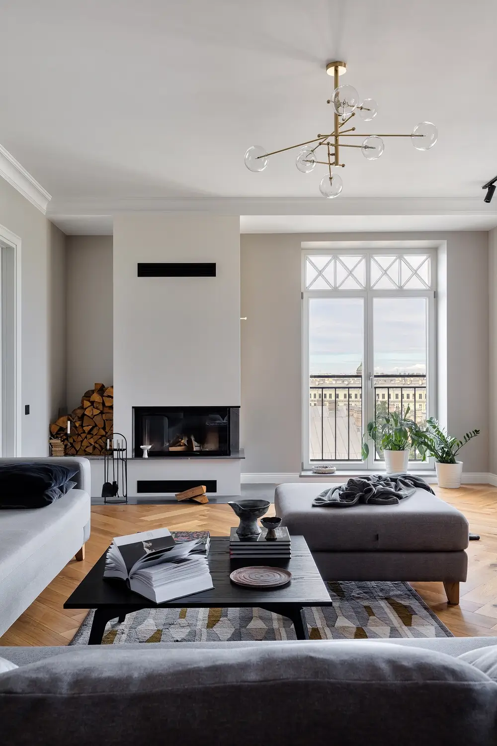
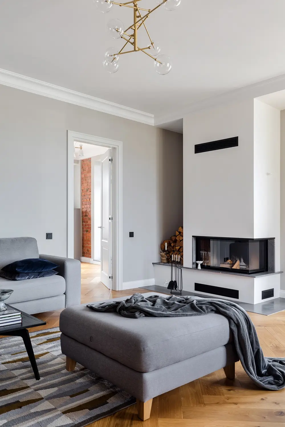
Initially – it was a communal apartment. Of the authentic elements, we kept two old tiled stoves, which were restored. When the windows were replaced, we recreated the historic glazing. There was another stove in the common kitchen, but it had no historical value, so we dismantled it, but in the room with the firewall we found chimneys, and we decided in addition to the French balcony to make a fireplace in the modern interior of the living room.
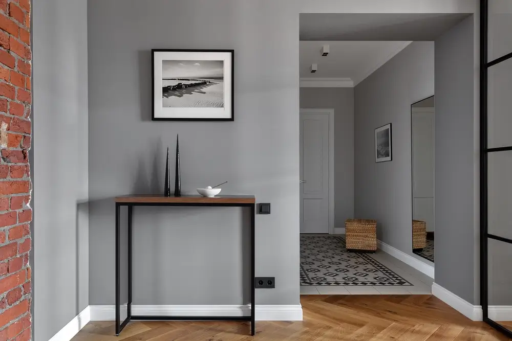
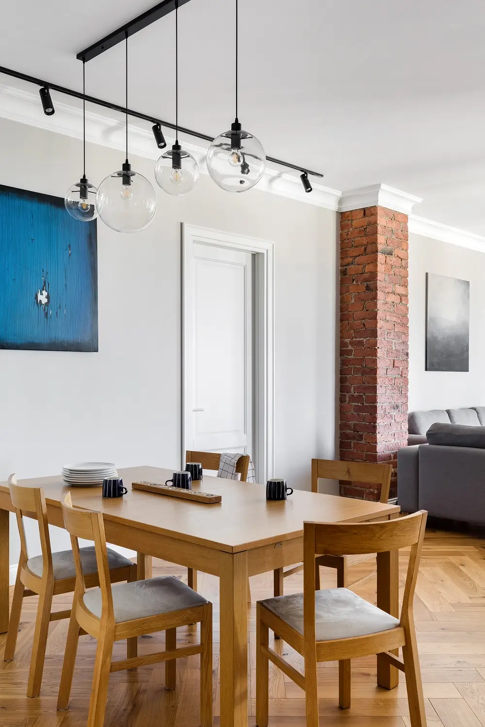
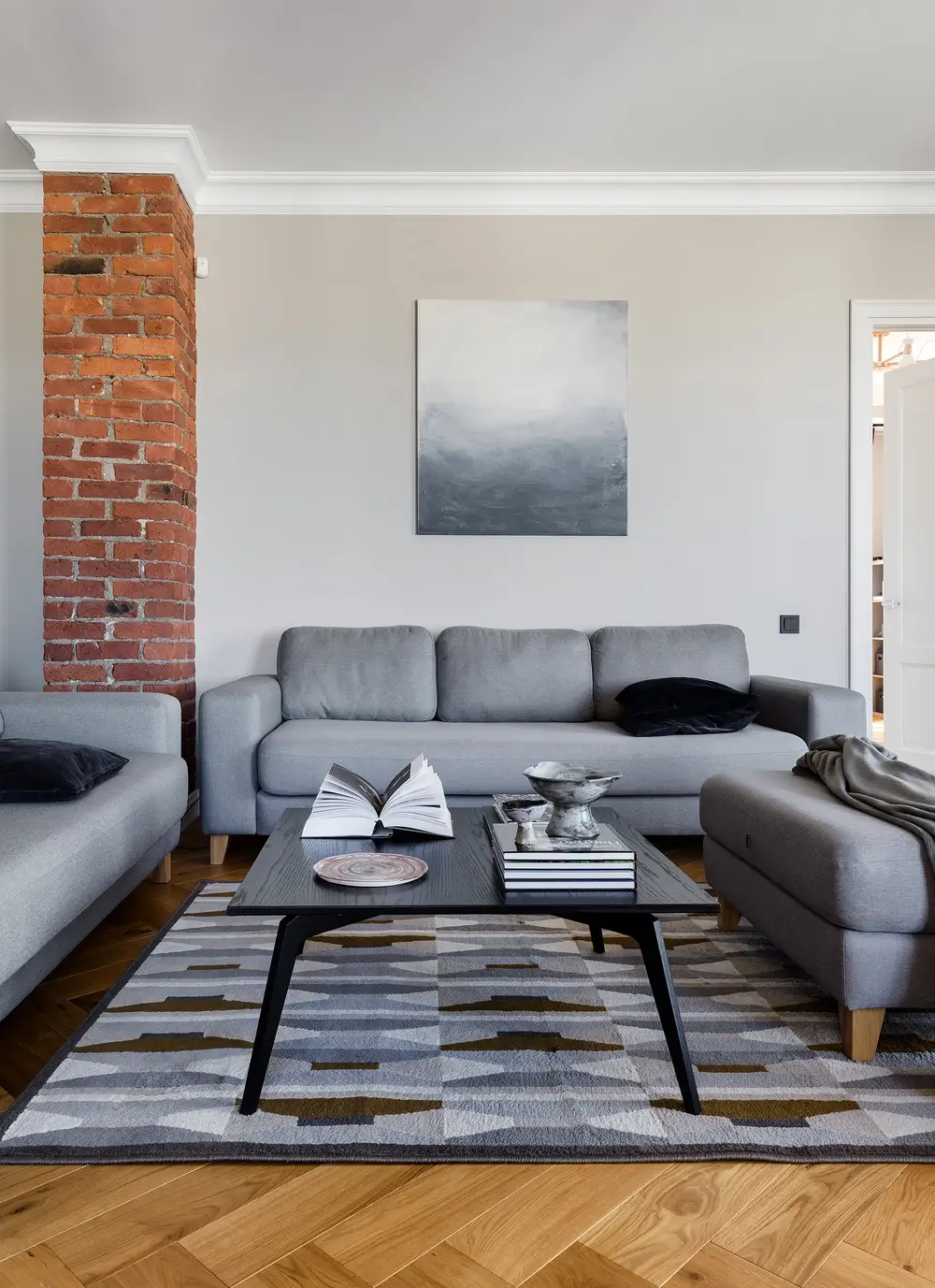
Usually in all old stock, we demolish everything down to the floor beams. Here we did the same thing. The beams turned out to be in excellent condition, the masonry brick walls were also good and we decided to partially leave the brick in the interior.
We drew about 15 different options in the process of creating the layouts. Now, a year after the completion of the construction, we understand that we chose the best option, in which we created a comfortable layout with spacious rooms and filled the interior with suitable materials and items.
The apartment has a main central axis, on which the kitchen-living room, cabinet and hallway are located.
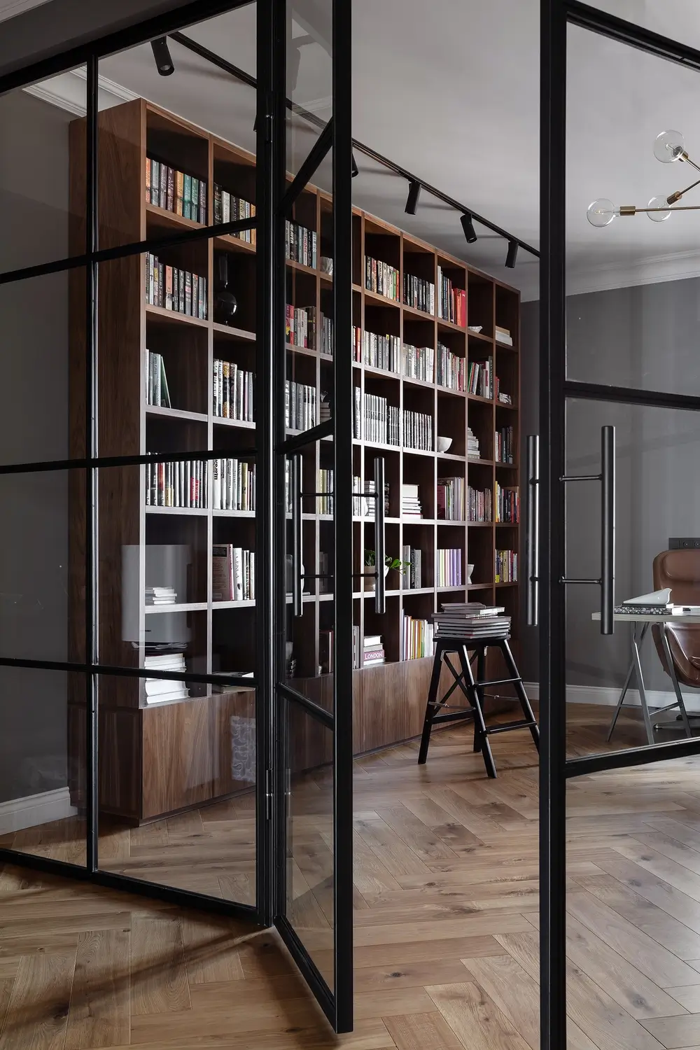
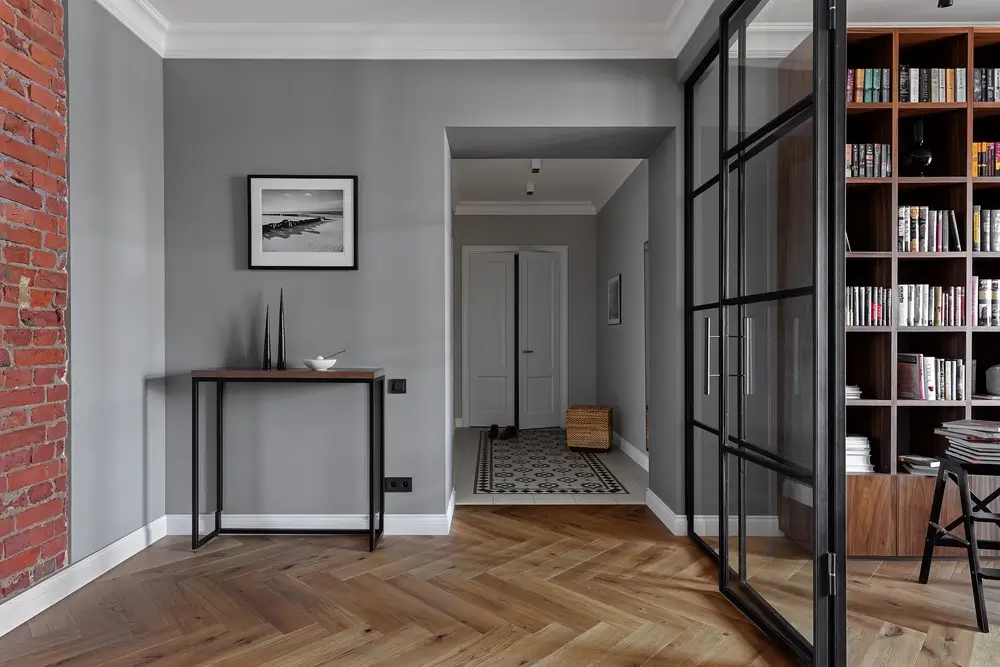
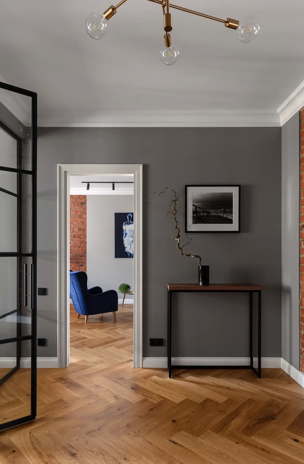
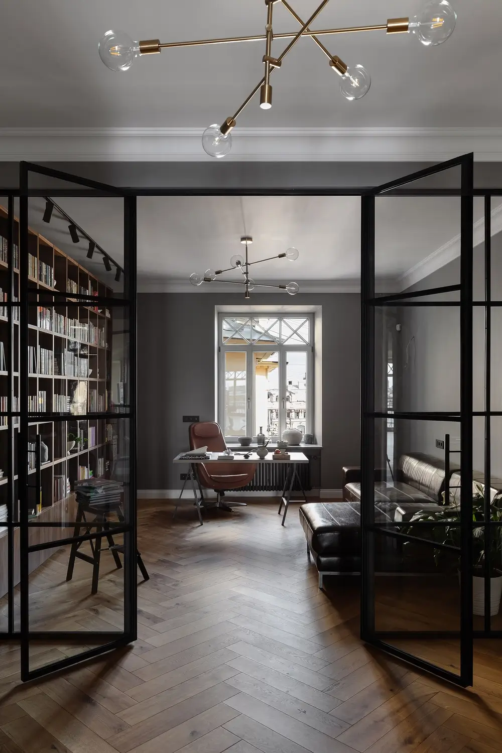
And this axis runs through the center of the new opening for the French balcony, the opening between the hall and the kitchen and the center of the window in the cabinet. We were able to create the effect of enfilade space. The cabinet has a window with the cour d’honneur, and there is not much light, but in the kitchen-living room, on the contrary, it is flooded with light due to the orientation to the south and the new doorway. Because of this the effect of the depth of the space, opening up to the light, is enhanced. We emphasized this effect by using darker colored walls in the cabinet and hallway. Also, instead of the usual blank wall we separated the cabinet with a glass partition, which allowed to light the cabinet and not make the hall into a visually confined space.

Scandinavian style apartment design. Main idea
At the entrance to the apartment, in the hallway there is a large dressing room and the entrance to the utility room, which is hidden behind the invisible door. To finish the floor in the hallway we used German tiles “TopCer” with a pattern.
Then comes the hallway from which we can get to the kitchen-living room, cabinet and master bedroom.
The customers are people who read, so in the cabinet along one wall we placed a large bookcase made of American walnut, where the family library is kept.
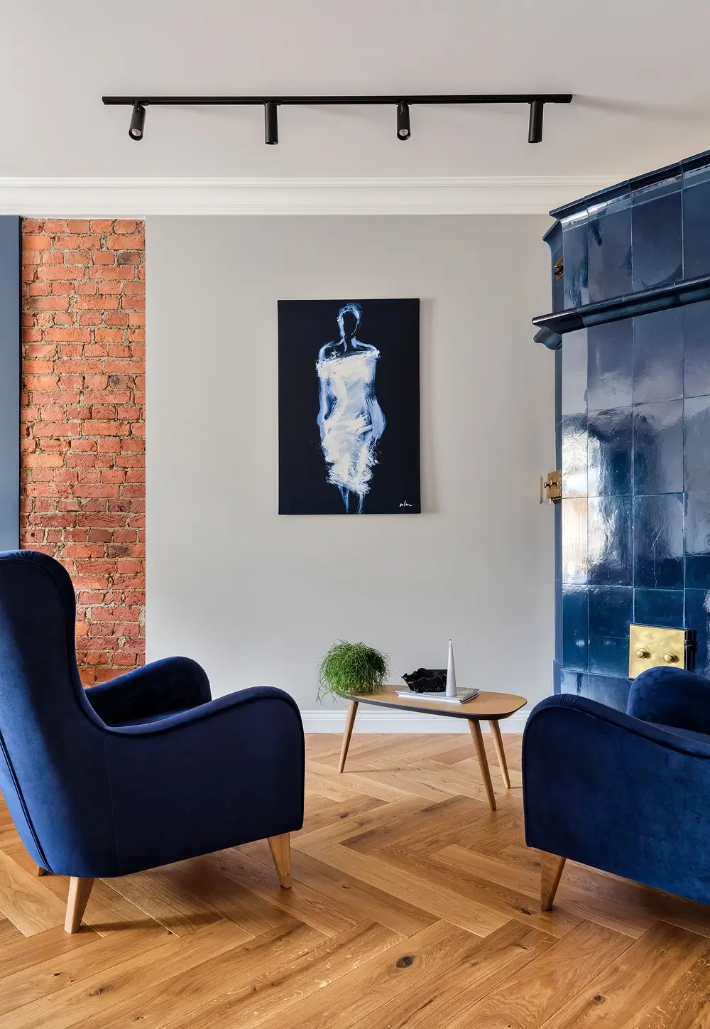
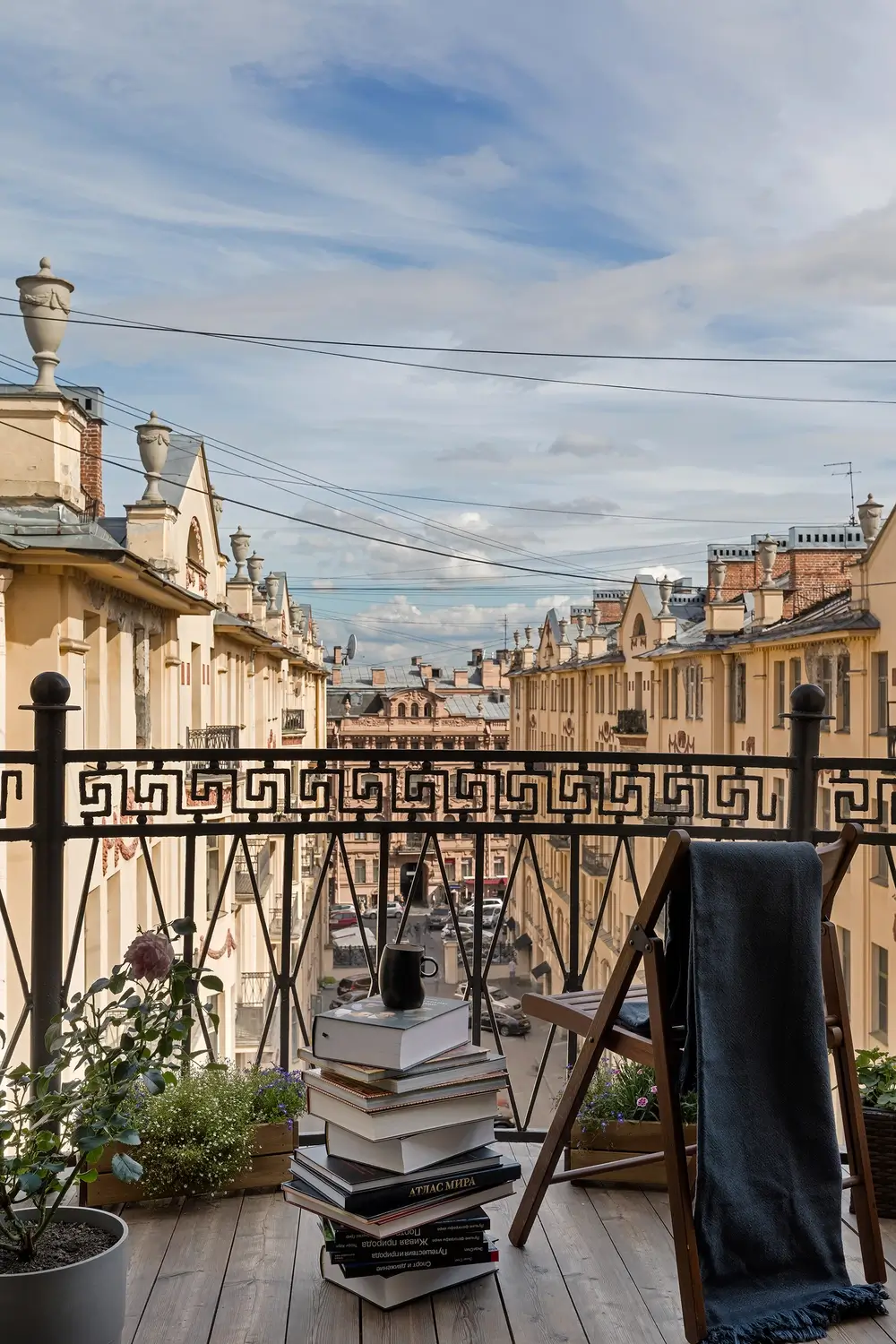
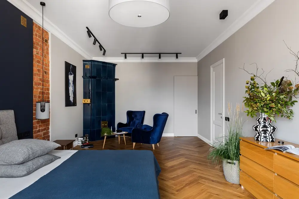
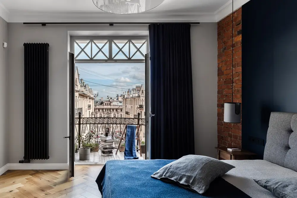
The bedroom has access to a small semi-circular balcony overlooking the courtyard of the house and the street. On the balcony, the hostess has arranged a small garden. Next to the exit to the balcony we placed a black radiator. Near the bedroom is another closet and a passageway to the master bathroom. In the bedroom, one of the historic blue fireplaces was restored. We supported this color with armchairs of the same shade.
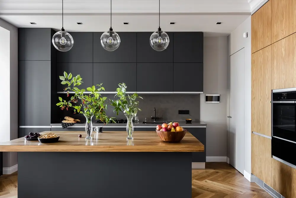
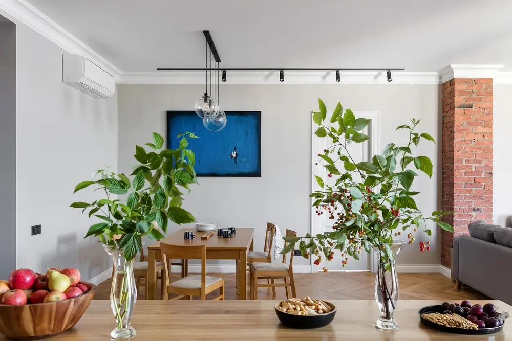
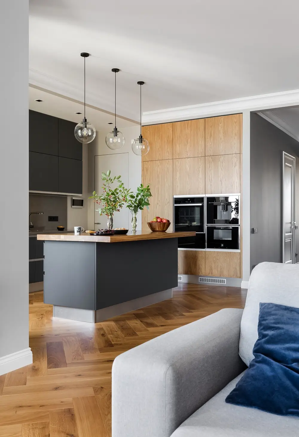
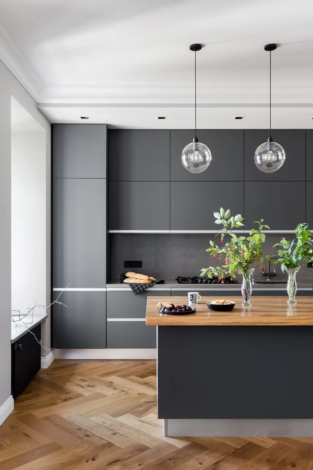
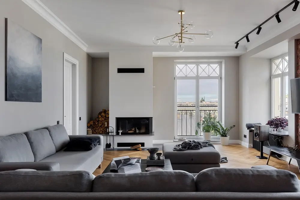
The kitchen room is the biggest room in the whole apartment – about 80 square metres. We have decided not to zoning it. The division of space was solved with the help of furniture: a dining table, kitchen island, sofas.
From the kitchen area there is a second entrance to the utility room and from there to the back staircase. Also from the kitchen room you can get to the nursery and two guest rooms.
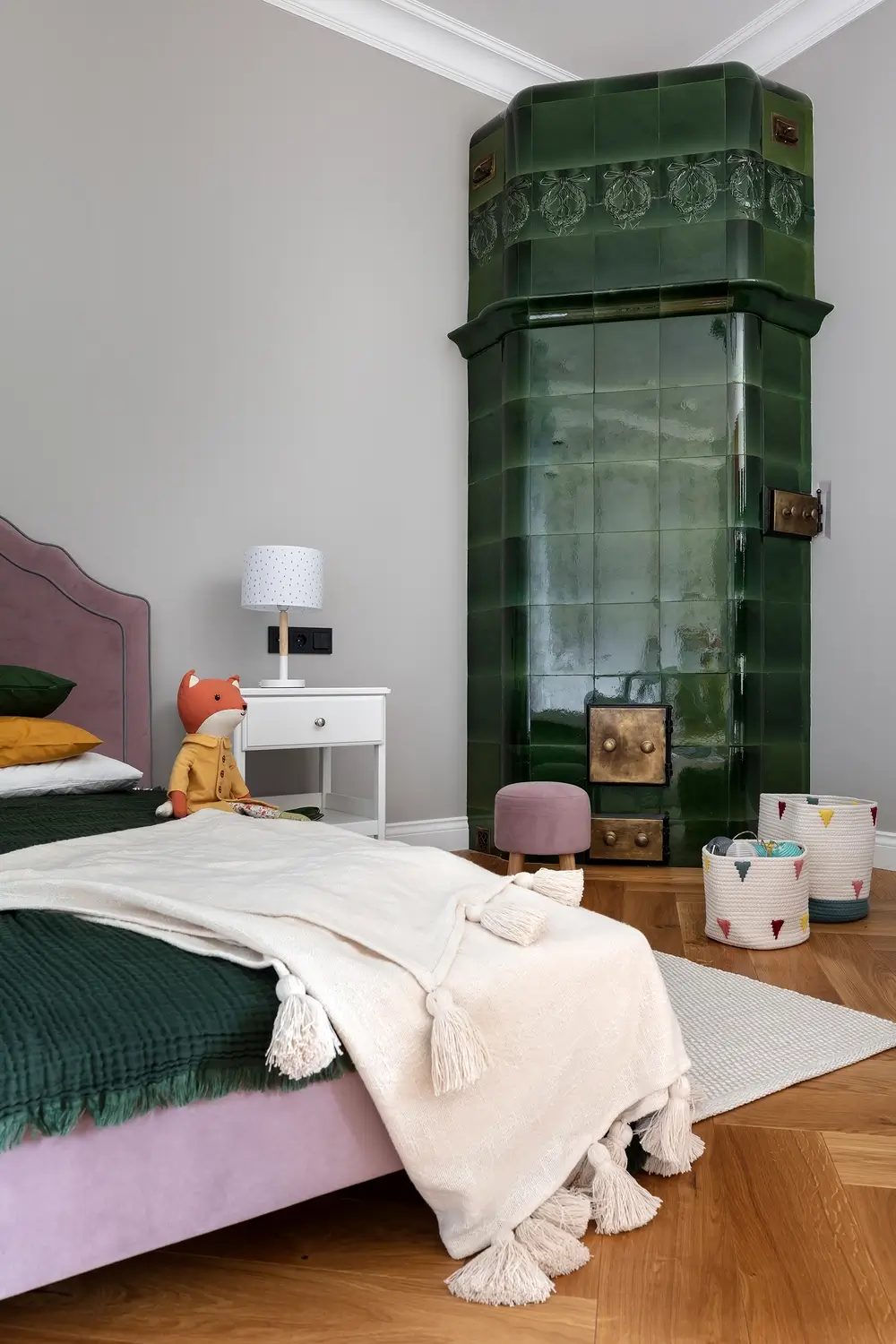
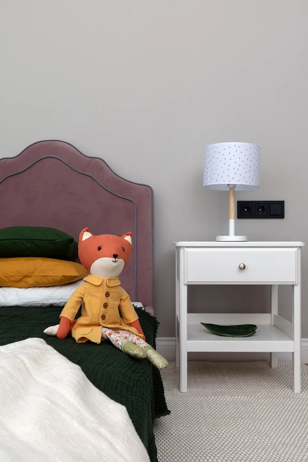
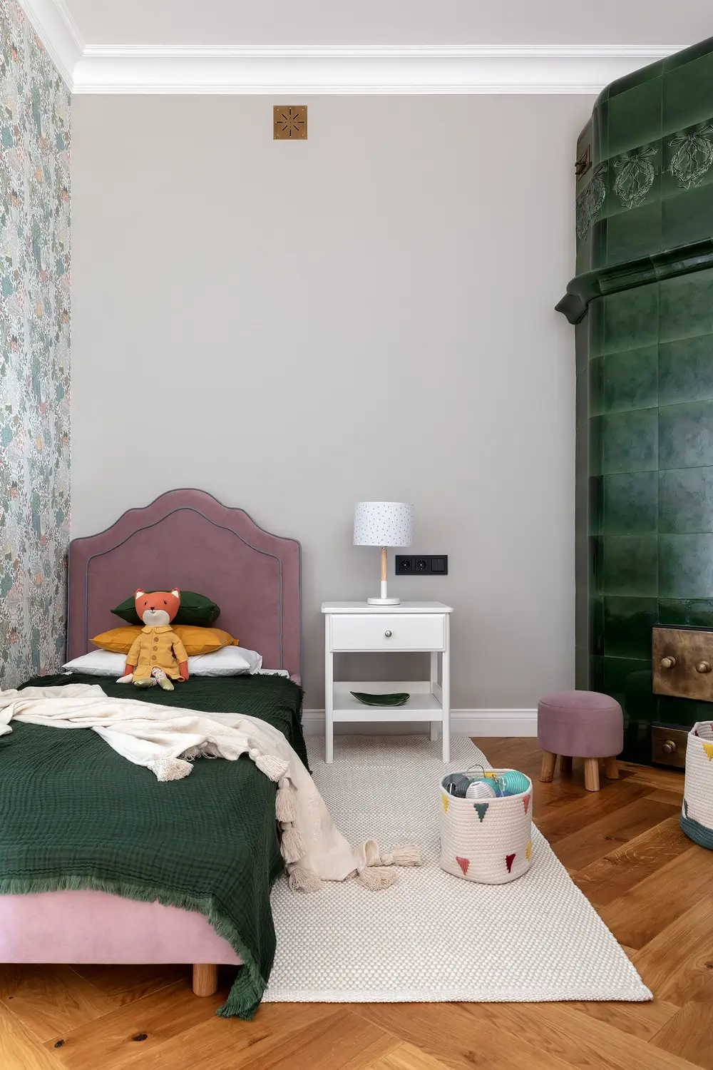
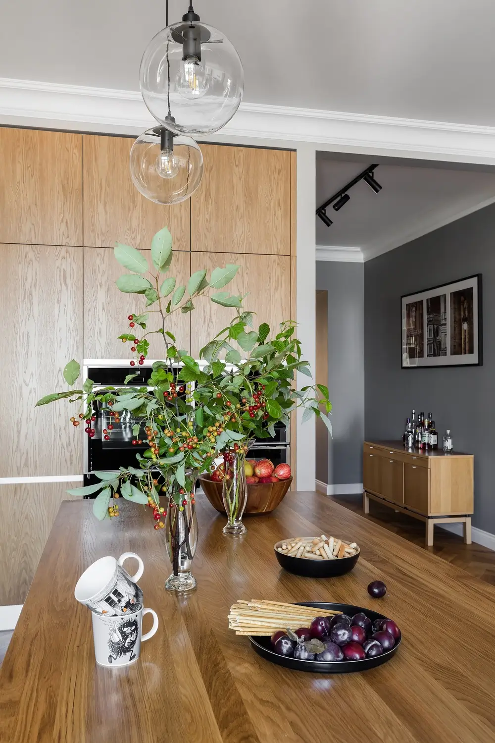
The children’s room has another old stove, but in an emerald color. The kitchen area is a color contrasting spot in the overall volume of the space, as it is made in dark color scheme with inserts of natural wood.

Scandinavian style apartment design.
What have we done
Since the owners’ family is half Swedish, the old Ikea table set from the old apartment was moved into this one. It is still an old Swedish Ikea, which is fifteen years old and was brought from Stockholm. It looks very authentic and totally fits the style.
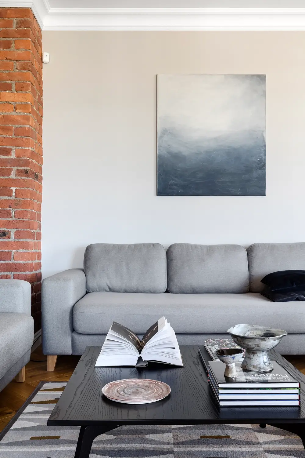
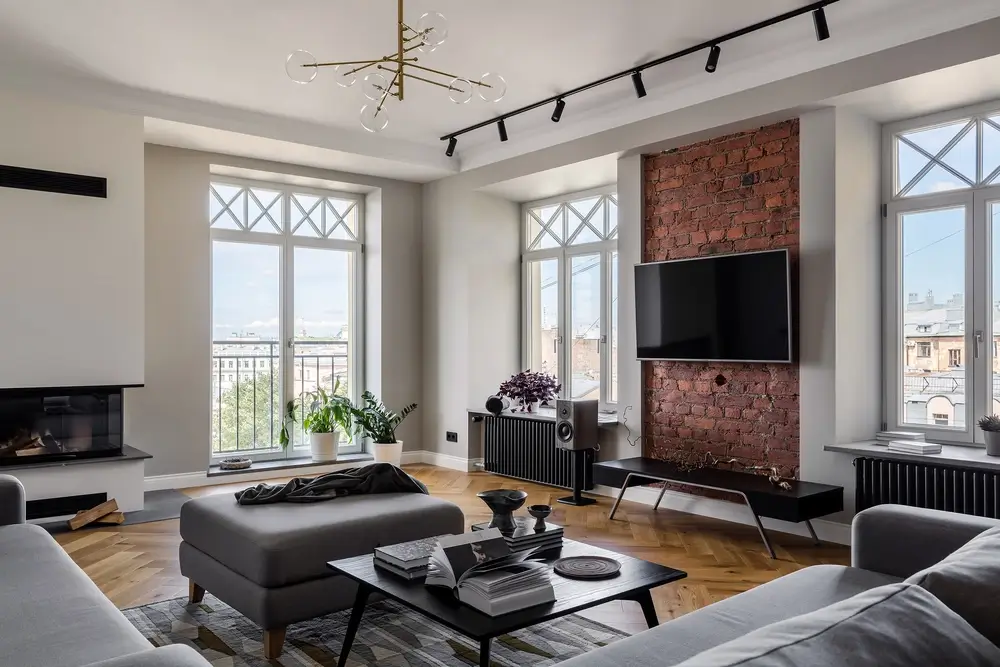
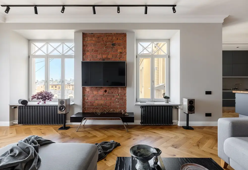
The sofa area in the living room was made in gray tones, with a dark coffee table and a small carpet. The exposed brickwork on the walls and two abstract paintings by a St. Petersburg artist were color accents. But the main decorative element of this space is a wood-burning fireplace in a modern style and a large French balcony with a view of historical roofs of St. Petersburg.
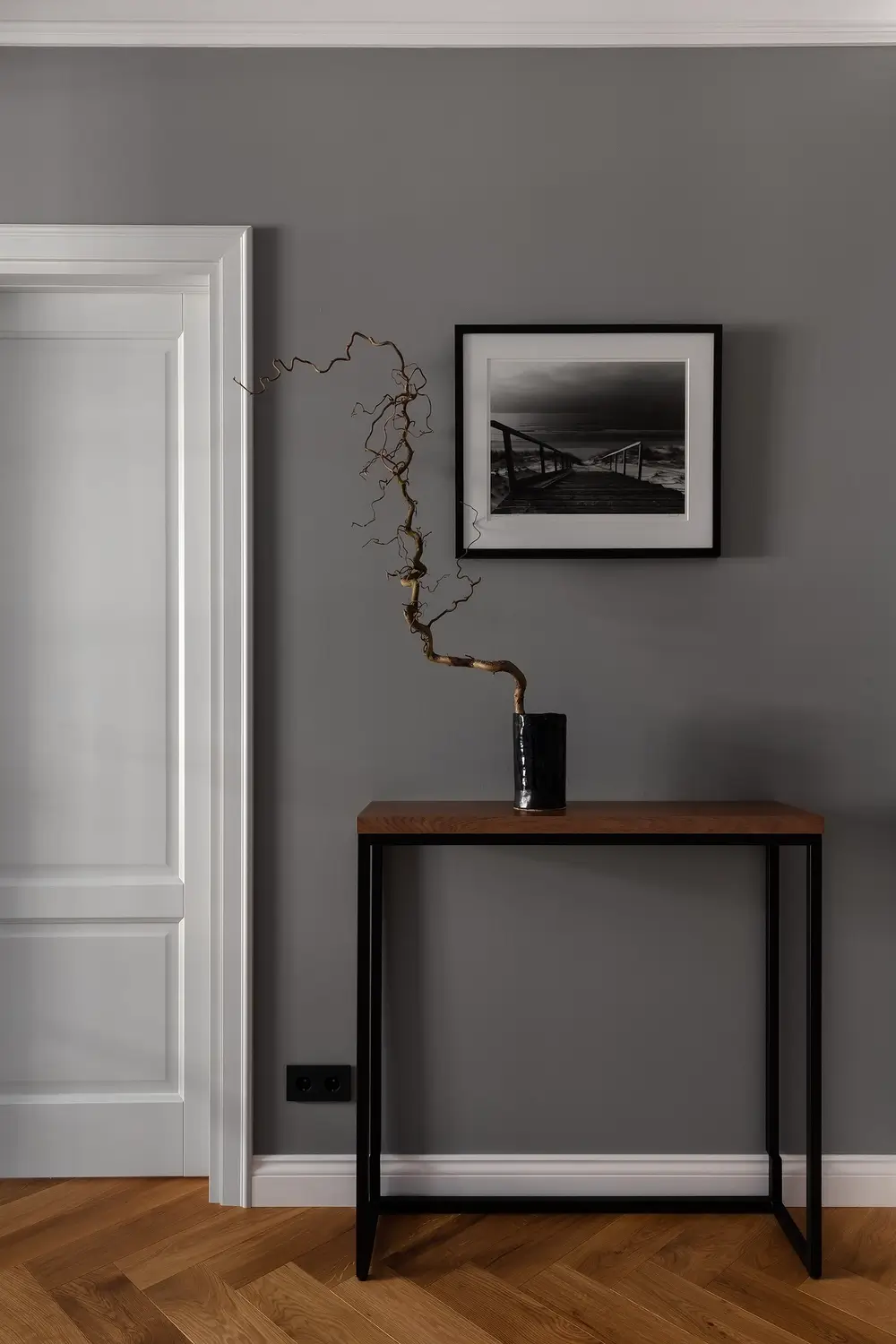
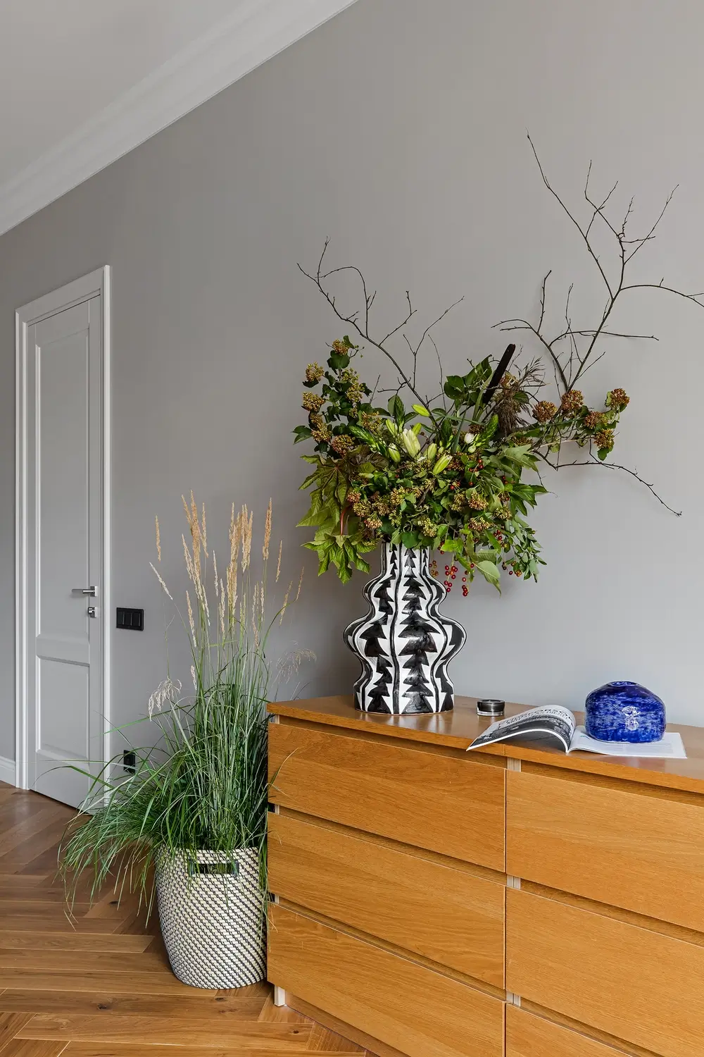
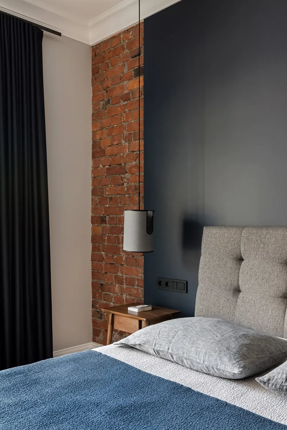
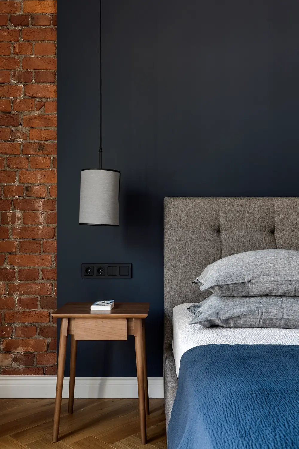
There are no specially contrived decorative elements here; everything is very laconic and restrained in the Swedish way. The color scheme is gray with a brightness of shade with inserts of preserved bricks. Only in the bedroom we painted the wall near the headboard in dark blue to support the color scheme of the furniture and the old stove. The walls in the apartment are decorated with black and white and color photographs. The flooring is single throughout (except in the bathrooms) – a parquet of natural color.
Lighting is designed in different types. The height of the ceilings allowed us to use not only our favorite track lighting fixtures, but chandeliers as well. All the chandeliers except the chandeliers are black, which gives the ceiling geometry, and the chandeliers are made of bronze and wood, which corresponds in color to the floor.
But despite the Scandinavian interior design of the apartment, the most valuable thing here is the space itself. The spacious rooms, some of which are filled with light, while others are in subdued semi-darkness, harmoniously complement each other in the overall concept of space.
During the construction work, we faced a number of difficulties. For example, during the opening of a French balcony, it was not possible to fit a special truck with a cradle to the firewall, as the arches of the house were very low. We had to perform this through the neighboring school, in addition, our builders suffered with the massive historic masonry wall.
When winter began, during the final phase of construction we had a roof leak over part of the rooms, and we put work on a pause until we replaced some of the old tin sheets on the roof.
In the end, the whole process from the start of the design work to moving in took almost 2 years, but it was worth it! We had a very bright and fresh interior, in which we were able to maintain the spirit of the old city, combining the historical context with touches of modern life.


